


Separating Price Inflation From Asset Inflation (Stage Two Analysis)
By Daniel R. Amerman, CFA
TweetIn our prior analysis we took a historical look at 40 years of data and the relationship between inflation and the annual average price of gold. What we found out was that the degree of correlation was about 73 percent. So using annual averages over the long term, about 73% of gold price changes can be explained on the basis of changes in the consumer price index.
But yet, the relationship with inflation looks very different than what most people believe. Increases in inflation were not consistently producing the increases in gold prices that they were supposed to. Gold was not always keeping up with inflation.
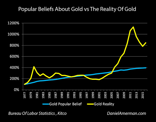
So we have this contrast between the blue line of the popular belief of what gold should be doing, which is tracking right with inflation, and the yellow line of what gold is really doing. Yes, both trend upwards, but clearly there are some major differences.
To better understand how gold prices really work, in this analysis we will "raise our game" a bit. To do that, we will need to look at the world more in terms of how a professional financial analyst would, rather than how information is usually presented to the public.
This type of analysis is also essential for people who think that overvalued stock, bond or real estate markets will necessarily produce future deflation. Or for those who think that excessive societal debt levels will necessarily lead to large defaults (or bail-ins) at some point, which would then create major deflation. Those are understandable but quite dangerous oversimplifications, as we will explore in this analysis.
Types Of Inflation & Deflation

Our starting point is that there is more than one type of inflation - and more than one type of deflation. As a simple example, let's look at pure asset inflation. We have the years, it could be year zero and year ten, or it could be year zero and year one, however we want to look at it.
The CPI is unchanged at 100 in both years. That means the purchasing power of the dollar has not changed.
But our asset has gone from being worth $100 to being worth $150. So clearly, whether we're looking at this nominally (without adjusting for inflation) or in real terms (adjusting for inflation) - we're up by $50.
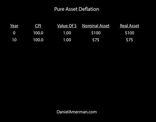
It is the same thing when it comes to pure asset deflation. Again the CPI is 100 in each year, meaning the purchasing power of the dollar is $1.00 in each year. But in this case our nominal asset value has dropped from $100 down to $75. So we clearly lost 25 dollars.
However, when most people talk about inflation and deflation - this is not at all what they are talking about. Instead they are usually talking about changes in the purchasing power of the dollar.

Let's take a look at pure price inflation as it is normally experienced. Using round numbers again, the CPI goes from 100 to 150. And if it takes $150 to purchase what $100 used to, that means that the purchasing power of the individual dollar has gone from $1.00 down to 67 cents.
And let's say that we had an asset which could be gold, or it could be stocks, or it could be anything else. It started out at $100, it became worth $150, and it looks like we've gained $50 in value.
But we have a complication - those 150 dollars are only worth 67 cents each in terms of purchasing power. So we multiply the $150 in nominal asset value (the non-inflation-adjusted value) times the actual value of a dollar and we come up with a real asset value of $100.
So we haven't really made anything in terms of purchasing power, all we've done is to keep up with inflation. This is a whole lot better than not keeping up with inflation, but nonetheless, we didn't make a real profit.
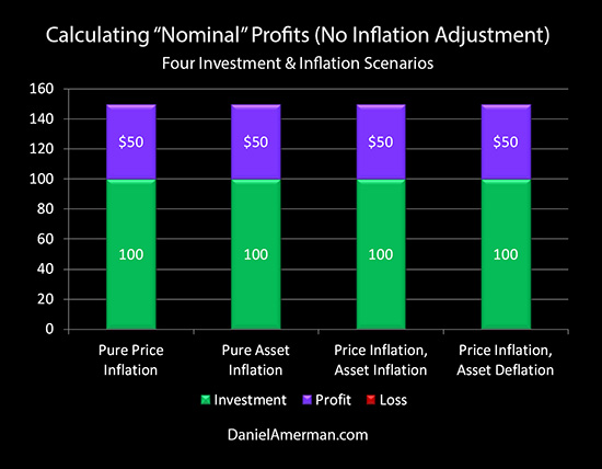
So let's compare these two graphically with the two left columns in the "Calculating 'Nominal' Profits" graph above. If we look at pure price inflation we start with the green bar of a $100 investment and we add on the purple bar of a $50 profit. If we look at pure asset inflation we start with the green bar of a $100 dollar investment, and we add on the purple bar of a $50 profit. The two are identical and indistinguishable.
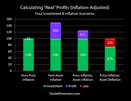
However, the "Calculating 'Real' Profits" graph above shows what is actually going on. With pure asset inflation we start with $100, we gain another $50 in purchasing power as shown in the purple bar, and we're really coming out ahead by about 50%. However, if we compare that to pure price inflation, we started with the same green bar of $100 in purchasing power, but there is no purple bar of profits, so we end up where we started at with $100 in purchasing power.
Now, that's a pretty material difference. When we look at just the surface, the way in which information is usually presented to the public, then the two types of inflation are identical.
But yet, when we look at what matters - which is what our assets will purchase - then with one type of inflation we can identify a 50% increase in our wealth. However, when we look at this the other way and with most common usage of "inflation" - we simply can't tell the difference between +50% and +0%.
Is that acceptable to you?
Let's take a look at pure price deflation. This is uncommon in modern times but it used to be more common when we had currencies that were backed by gold or other tangible assets.
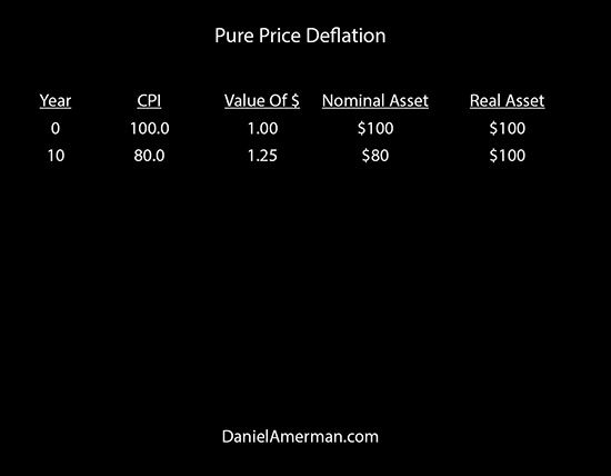
With pure price deflation, which is what most people mean when they say deflation, we start off with the CPI at 100 and it goes to 80. Deflation is a decrease in the number of dollars needed to buy something, which means an increase in the purchasing power of each individual dollar. So a dollar now has a purchasing power of $1.25 after the period of deflation, rather than the starting value of $1.00.
If our nominal asset goes from being worth $100 down to $80 - but each of those dollars will buy $1.25 - then the purchasing power of the asset is unchanged at $100. It looks like we lost money, but because money is worth more, we broke even. Again, this is rare in modern times, but it used to be relatively common.
Now where things get really interesting is when we start to get closer to the real world. Historically, in the modern world there has been as a matter of policy an almost continuous process of inflation where the consumer price index increases at least a little bit almost every year, meaning that the dollar buys at least a little bit less every year.
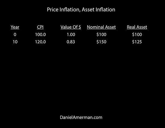
At the same time we have asset values going up and down in terms of how much they will buy. So if we start off with the CPI of 100 and it becomes 120 that means that the value of a dollar - what from the dollar will buy - has decreased to 83 cents.
Now let's say our asset went from a market value of $100 up to $150. So it started off being worth $100, we ended up with $150 - but each dollar is only worth 83 cents. When we multiply that out, the asset is worth $125 in purchasing power terms.
So here we have a mixture of price inflation and asset inflation, where $25 of the apparent increase in the value of our asset was just the decreased purchasing power the dollar, and the other $25 was real appreciation.
Now let's consider another example that most people don't think about - but is (unfortunately) historically reasonably common. That is the combination of price inflation and asset deflation.
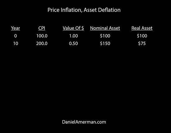
Let's say we start off with CPI being 100 and it goes to 200. Well, if what used to cost $100 in terms of a basket of goods and services - an average lifestyle - now costs $200, that means that the purchasing value of each of those dollars has obviously gone from $1.00 down to 50 cents. Now, let's say that the market value of the asset went from $100 to $150.
On the surface, that looks good - it is another example of a 50% gain.
But when we take into account what really matters it comes to investments, which is what they will buy for us in terms of lifestyle, in terms of security, and we take that $150 and multiply it times 50% to account for the reduced value of money, then our real asset value is only $75.
So we have in fact lost 25% of the value of our investment. Yes, it looks like we have 50% more but that's just because the loss in the value of the asset has been covered over by the destruction in the purchasing power of the dollar. This is an example of simultaneous price inflation and asset deflation.
So let's take a look at our green and purple graphs again. If we look at things the way information is usually presented to us (which is just dollar prices) and we look at all four scenarios of pure price inflation, pure asset inflation, the combination of price inflation and asset inflation, and the combination of price inflation and asset deflation - they are identical. We have a $100 investment in each case, there is a $50 profit in each case, and the results are indistinguishable.
But when we raise the sophistication of our analysis just one notch and look at the world the same way that a professional financial analyst does, then we see that we have entirely different real profits. There is no gain if it's all just price inflation, and there is a 50% gain if it is all asset inflation.
Assuming the norm for modern times which is ongoing price inflation, then it could be that the value of our asset went up by 25% - or it could have gone down by 25%.
And if there is anyone who should be the most interested in seeing the world in this way - it should be gold and silver investors who are specifically investing to protect themselves against inflation.
The Historical Record - Four Ten Year Periods
So let's take this improved vision for seeing real changes in value and look at the historical track record, initially in ten year increments.
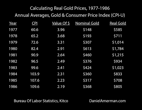
Starting in 1977 the CPI was 60.6. It reached 240.0 in 2016 (annual average). So that means that in 1977 a dollar would buy what $3.96 would today, it was worth almost four times as much as a 2016 dollar (240.0 / 60.6 = 3.96).
The average nominal price of gold in 1977 was 148 dollars an ounce. When we adjust for purchasing power, and each of those dollars being worth 3.96 current dollars, the gold was worth $585 an ounce.
By 1986 the purchasing power of the dollar had fallen all the way down to $2.19, meaning there was a major amount of price inflation. The price of gold had risen to $368 an ounce. Taking into account that the dollar in 1986 was worth the equivalent of $2.19 today, that meant that gold had increased to $805 an ounce in real (inflation-adjusted) terms.
So in that decade we had a combination of major price inflation and simultaneous asset inflation - which was quite deceptive. It looked like gold increased in value by almost 150%, from $148 to $368. But most of that was deception caused by the destruction of the value of the dollar, and in fact the real wealth of gold investors only increased by about 38%, from $585 to $805.
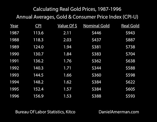
In 1987 the purchasing power of the dollar was $2.11, and by 1996 that was down to $1.53. During that same time gold fell from $446 an ounce down to $388 an ounce. That means that the real value of gold fell from $943 an ounce down to $593 an ounce.
This was a real world example of simultaneous price inflation and asset deflation - and this was again, highly deceptive. It looked like gold only lost about 13% of its value. But gold actually lost about 37% of its purchasing power. The loss was almost 3X greater than it appears, but this was covered over by the destruction in the value of the dollar. Which we can only see if we separate price inflation from asset inflation and deflation.
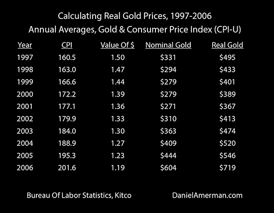
When we go to 1997 to 2006, the value of the dollar started at $1.50 and it fell to $1.19. The real value of gold started at $495 an ounce and it increased to $719 an ounce. So that's an example of simultaneous price inflation and asset inflation.
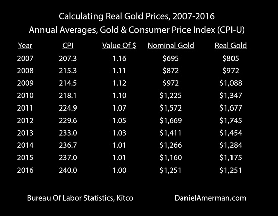
If we go to the years 2007 to 2016, based on what the government says that the value the dollar has been (whether that is accurate or not is a different question), we started off with the dollar being worth $1.16, and it ended up being worth $1.00. So the real value of gold went from $805 to $1,251 dollars. So again, this was simultaneous price inflation and asset inflation and how much value we really gained - we really have no idea - until we adjust for price inflation.
Historical Examples Of Individual Combinations
Now let's look at some better historical examples of some of the individual combinations of price inflation and asset inflation and deflation.
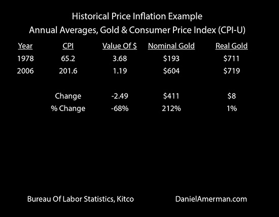
If we go to the year 1978, the purchasing power of the dollar was $3.68. By 2006 it was $1.19. That's a reduction of $2.49 or 68 percent. If we look at gold it went $193 to $604 which is a $411 gain or 212%, which is very attractive.
But in reality-based terms, when we just adjust for the purchasing power of the dollar - gold was almost unchanged. It was $711 to begin with in 1978, and it was $719 almost 20 years later in 2006. That is a change of only $8 or 1%, so this is a very good historical example, using actual annual average gold prices, of almost pure price inflation.
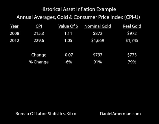
We also have a good historical example of very close to pure asset inflation. If we go between the years 2008 and 2012 the value the dollar went from $1.11 to $1.05 and that is a change of only six percent (according to the government).
Gold, however, in real terms went from $972 up to $1,745 and that is a $773 change, which is up 79 percent. So there's a little bit of price inflation there, but the overwhelming source of the change in prices was asset inflation.
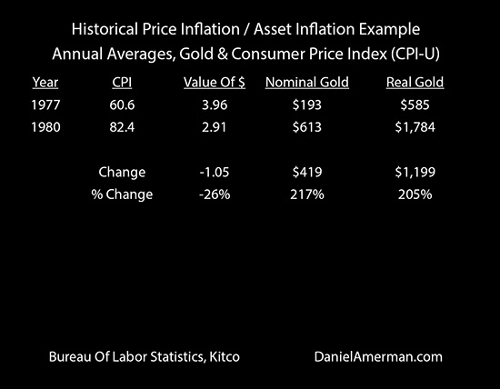
We can see a good example of price inflation and asset inflation working together in the years 1977 to 1980 where a dollar went from a purchasing power of $3.96 down to $2.91, losing 26 percent of its purchasing power in just three years. At the same time, the real value of gold went from $585 up to $1,784 an ounce, so this is simultaneous and powerful price inflation and asset inflation.
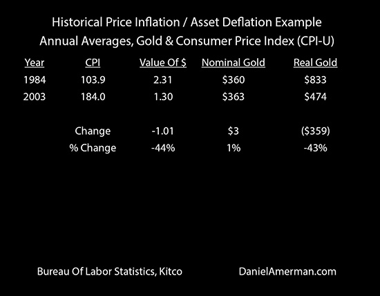
The above is an example of the quite different (and historically common) combination of price inflation and asset deflation. Comparing the years 1984 and 2003, if we look at nominal gold it was worth an average of $360 an ounce in 1984, and it was worth $363 an ounce in 2003. So it looks like we're ahead by three dollars, just barely above breakeven.
But the dollar fell by 44 percent over that almost 20 year time period. So in real terms, in 2016 dollars, we went from $833 an ounce down to $474 an ounce. So there was a devastating 43% loss in purchasing power for gold that's was entirely hidden by the 44% destruction in the purchasing power of the dollar. Major price inflation entirely covered major asset deflation, and even created the (quite taxable) illusion of a small profit. (A detailed analysis of how price inflation creates hidden gold taxes is linked here.)
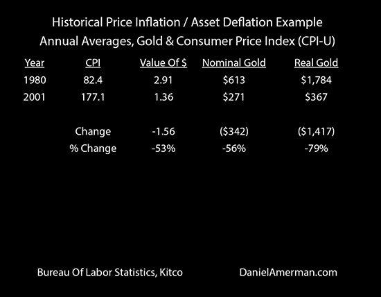
An even bigger example of historical asset deflation can be seen if we go to the years from 1982 to 2001. We start with the dollar being worth $2.91 in purchasing power compared to today, and it ended up worth $1.36. At the same time gold went from a nominal value of $613 an ounce down to $271 an ounce.
When we put that together in real terms, gold went from $1,784 an ounce in 1980, down to $367 dollars an ounce (in 2016 dollars) by 2001. What that means is that we have a 21 year period - which is in fact the majority of the 40 years of data that we're looking at - where we had a tremendous destruction in the purchasing power of gold, a 79% loss over those 21 years, where a large part of that was masked by the 53% decline in the value of a dollar.
Choosing Between Simple Inflation & Deflation Can Be Dangerously Misleading
Some people say the choice is between inflation and deflation - and there are extensive debates on that subject. Therefore many people look at the possibility of future asset deflation, and draw the entirely mistaken conclusion that this will necessarily produce price deflation as well. So the implicit idea is that if the stock market, bond market and real estate market are all overvalued - and prone to asset deflation - this somehow protects the value of money, and prevents price inflation (at least in the short term).
From that perspective, with the only choice being between inflation and deflation, then all we can see is the graph above. There is an identical 50% "inflation" in each case, the dollar value of the asset rose by 50%, so clearly there was no room for deflation. From this simple - and so common - perspective, inflation clearly won. Or, if asset values collapse, then it clearly must be deflation in our future.
But what history shows us is that the difference between our flat nominal green and purple bars and the radically different real (inflation-adjusted) purple, green, and red bars is no mere theory or speculation. This is our reality, this is what happens in practice. It contradicts what many people believe - but it is also dominant.
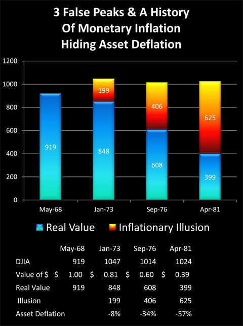
As shown in the graph above, and as analyzed in detail here, history could not be more clear that major stock market losses do not somehow protect the value of money. The common narrative (for those of an age or students of financial history), is that the Dow had three major bull market spikes in the 1970s and early 1980s, where it broke above the then magical 1,000 barrier but could not sustain.
But that narrative is based upon the pervasive myth of our four identical green and purple bars. When we "up our game" and separate price inflation from asset inflation, there never were three bull spikes, but rather three cases of ever more devastating asset deflation - with losses of 8%, 34% and 57% - being hidden by three cases of ever more devastating decreases in the value of money.
The longest and most severe US bear market in stocks since the Depression did not cause price deflation, but rather was accompanied by the most severe and sustained price inflation in modern times. And if someone is concerned by current stock prices - this is critical information.
Now let's take that same perspective and look at a different asset class in a different time period, by returning to gold between 1984 and 2003. It looks like it took 19 years for gold to go up in price by three dollars an ounce. But in very similar fashion to what happened with the Dow in the 1970s, what was really happening was a 43% destruction in the value of gold was being completely hidden by a 44% destruction of the value of money.
This is history, across different asset classes - each of which are considered inflation hedges - and different time periods. This is how the world actually works. But yet, it is also the direct opposite of what many people believe about the past and about today - and they could end up paying dearly for it. The widespread belief that overpriced assets necessarily somehow protect the value of our money, because falling asset prices will prevent an increase in price inflation - is clearly dangerously mistaken.
This ability to see with clarity is also essential when it comes to the belief that the current historically unprecedented levels of governmental, corporate and consumer debt will necessarily produce massive price deflation in the end, as the debt is potentially defaulted upon. That is one possible route, but it is not necessarily the most likely route, and it is predicated upon the dangerous oversimplification of treating the future as a choice merely between inflation and deflation.
Understanding these principles is crucially important for those who are entering into defensive strategies, such as investing in gold, in order to protect themselves from what they see as approaching turmoil.
Yet, these essential truths are also mostly invisible when we just look at the surface of simple price changes. We simply can't see what really matters - until we take things to the next level.
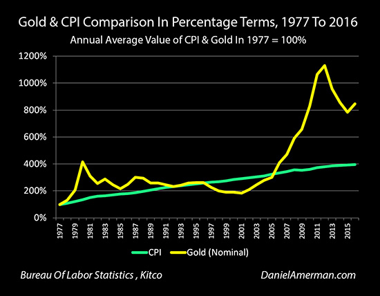
The above graph shows the historical relationship between gold prices and consumer prices. As described in the prior analysis - the relationship isn't perfect, but there is a 73% correlation.
The problem is that the preceding gold graph is based upon the same very common overly simplistic view of the world that is shown with the four identical bars above. There is just "inflation", rather than separate price inflation and asset inflation.
When we "up our game" and revisit the history of gold and inflation using a more sophisticated approach which splits price inflation from asset inflation, we get the completely different graph below.
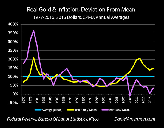
The underlying reality turns out to be radically different from the surface appearance. The "trending together" component now seems to mostly disappear when we compare the purple line of annual rates of inflation and the gold line of inflation-adjusted gold.
In the next analysis, we will take the tools and the perspective developed in this analysis, and revisit the actual mathematical relationship and correlation between gold values and price inflation. And when we run the numbers on that basis, the true mathematical relationship between gold and inflation may come as quite a shock to many long-time gold investors, as well as those who are thinking about buying gold.
This isn't a bad thing - it is a good thing. What is bad is making flawed decisions based on incomplete information. On the other hand - better and more complete information allows for making better decisions. Which should work strongly in our favor over time, even if the transition can sometimes feel a bit uncomfortable.
Read Stage Three of the analysis
 What you have just read is an "eye-opener" about one aspect of the often hidden redistributions of wealth that go on all around us, every day.
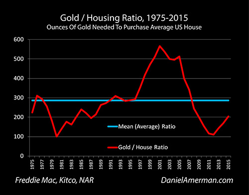
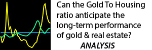
Over the last forty years, the Gold/Housing ratio has been a quite useful measure for evaluating relative values between real estate and gold. As explored in the analysis linked here, this ratio also has an interesting historical track record for identifying turning points in long-term gold price trends.
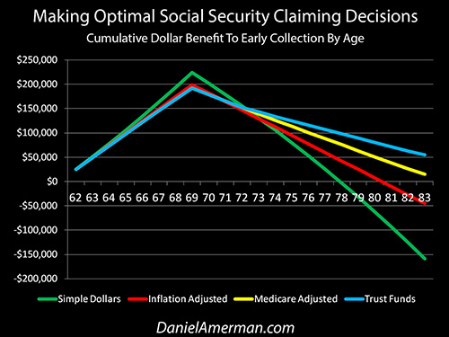
How tax rates are presented to the public can be quite different from how they really work – and the same is true of Social Security. The government strongly encourages people to wait as long as possible before collecting their retirement benefits – but as explored here, is that truly in your best interest, or are a few factors being left out?
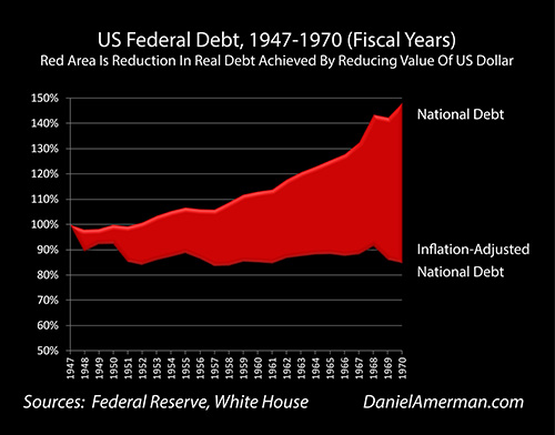
National debts have been reduced many times in many nations ─ and each time the lives of the citizens have changed. The "eye-opener" linked here reviews four traditional methods that can each change your daily life, and explores how governments use your personal savings to pay down their debts in a manner which is invisible to almost all voters.


If you find these "eye-openers" to be interesting and useful, there is an entire free book of them available here, including many that are only in the book. The advantage to the book is that the tutorials can build on each other, so that in combination we can find ways of defending ourselves, and even learn how to position ourselves to benefit from the hidden redistributions of wealth.