


Chapter Three
How Fed Cycles Create 6X The Real Estate Profits
By Daniel R. Amerman, CFA
TweetReal estate prices have behaved in a way over the last 20 or so years that has been almost completely outside of historic averages. Single family residences used to be a remarkably stable market that was insulated from the sharp gyrations of the stock and bond markets, never moving more than about 10% above or below long term inflation-adjusted average home prices, and always returning to average if prices moved too far away.
In the modern era, the long-term historic patterns and metrics that used to govern residential real estate pricing have completely shattered and have been replaced by something new. Real estate prices have been much higher on average, but have also become many times more volatile, with profits and losses that move at lightning speed and are a multiple of the old norms - with up to 6X the profits (and 5X the losses) - in comparison to historical norms.
As explored in the five graphs below, the fundamentals governing real estate valuation have changed, and understanding how prices work in the modern era requires taking new factors into account. National average home prices no longer exist in isolation, but are now much more tightly governed by such factors as changes in Federal Reserve monetary policy and cyclical changes in yield curve spreads.
This analysis is the third chapter in a free book, an overview of the rest of the book is linked here.
A 7.6X Increase In Value
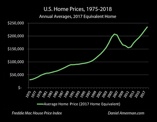
The graphic above shows the average price of single family homes in the United States between 1975 and 2018. The main data source is the Freddie Mac House Price Index, which has been calculated for every state as well as the nation as a whole since 1975. This is a much broader index than the better known Case-Schiller index which tracks only the 20 largest metropolitan areas. Like the Case-Schiller it uses a pair-based methodology, which is necessary to separate house price appreciation for the same size houses from the steadily higher prices associated with steadily larger average home sizes over the years.
(Average home prices in 1975 were actually quite a bit less, because the average home was quite a bit smaller than today, so we have to use a "like to like" pairs-based index that takes this into account such as Freddie Mac or Case-Schiller. However, the need for such an index means that it is much more difficult to analyze national real estate price changes before 1975 than is the case with stocks or bonds.)
As is visually obvious, the price trend is sharply upwards over the years, with the average house experiencing over a 7.6X increase in market value. It can also be seen that by 2016 average national home prices ($206,709) had reached the same levels seen at the height of the real estate bubble in 2006 ($206,386), and that 2017 and 2018 sales prices represent all-time records for single family homes.
However, the graph shares a problem with many other long term financial graphs, and this is what it is mostly showing is a decline in the value of the dollar. Most of our 7.6X increase in home values results from the dollar having about 4.7X the purchasing power in 1975 compared to what it does today.
Using Inflation-Adjusted Dollars To See The Patterns Of The Past
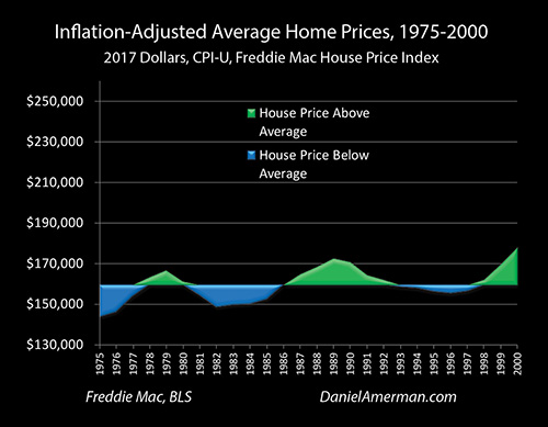
The graph above shows inflation-adjusted average home prices during the years 1975 to 2000, based upon the average purchasing power of the dollar in 2018. The Consumer Price Index (CPI-U) as reported by the Bureau of Labor Statistics is used to calculate the purchasing power of the dollar in each year. The graph ends in 2000, so it does not include the recession of 2001 that resulted from the collapse of the tech stock bubble, and set off the series of increasingly powerful Federal Reserve interventions that persist to this day.
The average (mean in this case) of inflation-adjusted home prices over those years is $159,465 (in 2018 dollars). Whenever the annual home price went above the average it is shown in green, and whenever it goes below it is shown in blue. Studying the graph we can see the "metrics" for how we should expect an investment in single family homes to perform:
1) Home prices oscillated up and down over the mean value, and the classic strategy of investing for a reversion to the mean would have worked over those years. Buy in the blue areas when inflation-adjusted home prices are low relative to the average, wait until time takes us into a green area where prices are high relative to the average, and then sell, in order to achieve results that exceed the rate of inflation.
2) The inflation-adjusted changes in price are relatively minor compared to some other asset categories, meaning that single family homes could be considered a relatively stable investment. The entire range of annual averages was from a low of $143,731 to a high of $177,974. The low never went more than 10% below the average, and the high peaked at 11.6% above the average.
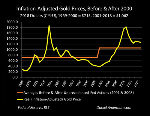
Indeed, it is quite clear that when we look at actual financial history on an inflation-adjusted basis, that single family homes in the United States were a far more reliable inflation hedge than gold prior to 2001. While the inflation-adjusted gold prices were wildly fluctuating in price on the left side of the graph above, housing was staying in a much more narrow range. This is not to say that gold is a poor investment - it has some outstanding and unique advantages when it comes to cycles of crisis and the containment of crisis - but being a reliable inflation hedge is not gold's main advantage for our current times.
3) The rate of change in inflation-adjusted prices is quite slow, taking years to oscillate up and down from peaks to troughs. As an example, it took seven years for the average house to gain about $25,000 in value between 1982 and 1989, and then it took another seven years for the market to give back $17,000 of those gains by the year 1996.
So when we take the traditional approach of studying the past and then projecting those results forwards into the future, then owning a home as residence and/or investment can with a high degree of certainty be projected to be a highly stable investment that oscillates around a mean. They should always stay within a range of roughly +/- 10% to the long term average of $159,465, changes in price should be gradual, and while the upside potential is quite low, so too is the exposure to the downside.
It is worth noting that because the inflation-adjusted annual value changes were so low, inflation was almost always enough to more than offset any real losses, So when we look at nominal dollars as shown in the top graph, with the exception of 1988 when the average national price of a home fell by a mere $7, every other year saw nominal (not adjusted for inflation) home prices rising over the year before.
While there were obviously exceptions for individual homes or regions, on a national basis the problem of going significantly "underwater" and having the house be worth less than the mortgage simply didn't exist. Indeed, based on the best available historical data and metrics by the year 2000, it would have been entirely reasonable for experts to assert with confidence that a national crisis with deeply underwater homes would be so unlikely as to be almost impossible.
Graph 1: Inflation-Adjusted Home Prices
So how have the well-established 20th century patterns governing home prices held up in the 21st century so far? Graph #1 of our five graphs (below) extends inflation-adjusted home prices through 2018, and adds a gold area to represent house prices that are historical outliers, meaning the value is entirely outside of the range experienced between 1975 and 2000.
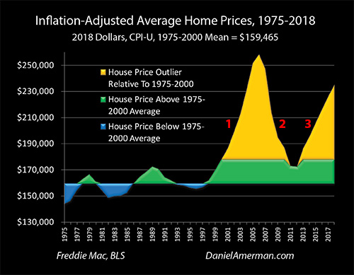
As is boldly visually obvious - there has been a complete model failure when it comes to depending upon the past to give us a reliable means of anticipating future risks and returns. Most of the surface area in the graph is now gold, meaning that almost all of what we have seen in practice since 2000 is an outlier, something entirely outside of what was experienced in the past.
By 2006, average home prices had risen to to $258,334 (in 2018 dollars), which was a little less than $100,000 above the long term average. This was a 62% increase from the average, meaning it was about 6.2X greater than the about +/- 10% range it was supposed to fall in.
Between 2006 and 2011 home prices fell by $85,426. Compared to the average price of $159,465, this was a 54% change, or about 5.4X greater than the +/- 10% range it was supposed to stay within. As previously noted, based upon the data from 1975 to 2000 the chances of an event like this happening and the resulting millions of underwater mortgages should have been close to statistically impossible - but it did happen, and to a degree that was far outside the previous patterns of risk and return.
Now, one could say that this was all the result of a one time anomaly, the expansion and collapse of the real estate bubble, but as is visibly obvious, that is not the case. Even at the bottom of the trough in 2011 and 2012, for the first time, average home prices did not revert to the mean.
The long term relationship completely fell apart, and after two years of what were over still some of highest real estate prices on record (over the long term), the direction reversed, and single family homes began another swift trip upwards.
When we adjust for inflation, then 2018 was no longer a new peak, as the average house was still worth about $23,000 less than the 2006 high. However, the fast climbing prices - for exactly equivalent homes - are still about $76,000 above the 1975-2000 average, which is 48% above that average, or almost 5X the previous maximum price increases.
So, it is not just the first golden spike, the trip up and down with the real estate bubble that was entirely outside the prior historical range. As can be plainly seen, everything since then has also been a direct contradiction of historical experience, with no reversion to the mean, and then a second swift round of price increases creating a second golden spike - with an almost uncanny visual similarity to the first golden spike in inflation-adjusted terms - that exceeds the outer limits of the former historical patterns by a factor almost 5X (so far).
Graph 2: Federal Funds Interest Rates
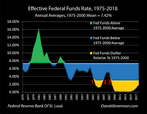
The second graph above uses the same color scheme to show changes in the Federal Funds rate over the same years. The average Fed Funds rate between 1975 and 2000 was 7.42%, and rates higher than that are shown in green, while lower rates are shown in blue. As can be readily seen - interest rates were far less stable than housing prices.
As the tech bubble popped and the Federal Reserve tried to escape the recession of 2001, they did something that has had a powerful influence on the real estate and other investment markets ever since - as shown in the area by the red numeral "1", they swung a "hammer" at interest rates, and smashed the Fed Funds rate down from 6.40% in December of 2000 to 0.98% in December of 2003.
That was the lowest Fed Funds rate since 1954, and it was a complete outlier for the modern markets. When real estate prices were moving into outlier territory for prices on the upside, this was being enabled by an outlier lowering of interest rates (shown in the golden area) to the downside - which is entirely logical, as lower interest rates means lower payments to buy things such as houses.
Graph 3: Yield Curve Spreads & Inversions
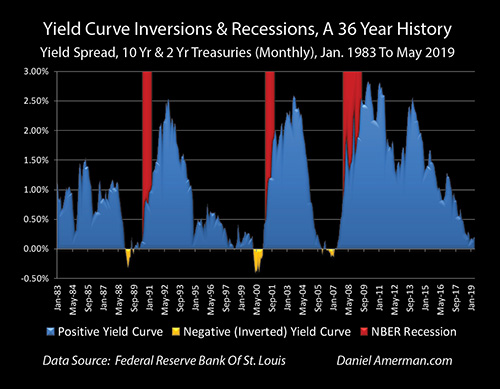
This core cycle - which has taken on an amplified importance in the last 20 or so years relative to the previous decades - can also be seen in the #3 graph above. The sequence was:
a) The Fed raised interest rates by 1.75% between June of 1999 and June of 2000 (this is equal to total current increases above the prior 0% floor through June of 2018);
b) This and other factors led to short term interest rates (the 2 year Treasury in this case) climbing above long term interest rates for the period between February and December of 2000, creating the golden area of the "inversion" above; and
c) A recession arrived by early 2001, as shown in the red area, and as predicted by what has been the completely accurate warning indicator record of the three inversions in recent decades (a more detailed analysis of the relationship between recessions and yield curve inversions is linked here).
As shown in the Fed Funds outlier graph (Graph #2), the golden area of Fed Funds rates bottomed out in 2003, and looking at the Yield Curve graph, that was the same year the blue positive yield curve spiked in August of 2003 at 2.58%, which was its peak for that particular cycle. So the lowest Federal Funds rates were correlated with the highest yield curve spread between short term and long term interest rates.
What Graph #3 connects is the interest rate cycle with the business cycle, and short term interest rates with long term interest rates. As covered in Chapter 1, when the economy gets in trouble - the Fed has always responded in the same way in the post World War II era, which is to smash down short term interest rates.
At the same time the Federal Reserve does that, yield curve spreads have historically risen very rapidly, meaning long term interest rates have not fallen nearly as far or as fast as short term rates. Because it is long term interest rates that determine 30 year mortgage rates, we have to go through this intermediate step of looking at the changes in the yield curve, in order to see changes in mortgage rates, changes in mortgage payments, and changes in home affordability.
(The unprecedented plans of the Federal Reserve to use quantitative easing to change how this relationship works in the event of another recession will be crucial for later chapters - as well as for future housing prices.)
Graph 4: Mortgage Rates
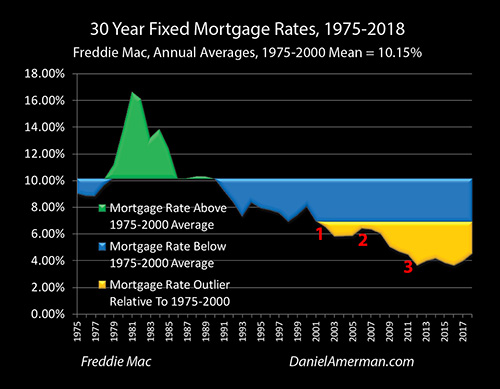
What is shown in the fourth graph above is the direct impact on mortgage rates of the extraordinarily powerful Federal Reserve interventions that were used to contain the damage from the tech stock bubble collapsing as well as the recession. As shown in the area by the red numeral "1" in this fourth graph, the Federal Reserve hammering down Fed Funds rates (Graph #2) created another "outlier" in mortgage rates beginning in 2002 .
More specifically, mortgage rates essentially equaled their previous historic low in 2001, even as inflation-adjusted home prices first moved outside their historical range. Mortgage rates then moved entirely outside the historical range in 2002, then again in 2003, and then stayed almost flat through 2005. Each one of those years, housing prices were quite quickly moving outside their prior historical range - with those prices being supported by the lowest mortgage payments in the modern era, relative to the price being paid.
Indeed, mortgage rates have been continuously in the outlier zone since that time, entirely outside the range that was experienced between 1975 and 2000, even as home prices have almost continuously stayed in their own outlier zone to the upside - and that is no coincidence.
The movement in rates is not as initially dramatic as with Fed Funds rates - but that is because 30 year mortgages generally price at a spread above the 10 year Treasury rate, meaning they are long term.
When the "blue spikes" of rapidly increasing positive yield spreads appear on the Yield Curve graph (Graph #3), they absorb much of the strength of the Federal Reserve hammer blows of the fast reduction of short term interest rates (Graph #2), and these decreases are therefore not fully passed through to the longer term mortgage interest rates (Graph #4), which means they are not fully passed through to affordability for home purchasers or income property investors.
Visually, if we look at the red numeral "1" on the Fed Funds graph, we see a plunge in interest rates as a result of Federal Reserve policies that greatly exceeds the reduction in interest rates that are near the red numeral "1" in the Mortgage Rate graph. The largest source of the difference is the explosion upwards of the blue positive yield curve spread that can be seen in the Yield Curve graph.
Both interest rates go deep into the golden zone of historical outliers - as a result of the exogenous factor of Federal Reserve interventions and with critical implications for real estate prices then, now and in the future. But the patterns are quite different, and the logical reason for the difference can be found in the cyclical changes in the yield curve that are also the result of the exogenous factor of Federal Reserve interventions.
Numerically, the Fed Funds rate fell from 6.24% in 2000 to 1.13% in 2003, which was a reduction of 5.11%. Thirty year fixed rate mortgage rates fell from 8.05% in 2000 to 5.83% in 2003, which was a much smaller reduction of 2.22%. Most of the difference can be explained by the yield curve spread moving from an inverted -0.23% in 2000, to a highly positive 2.36% in 2003.
When it comes to real estate prices, however, it is arguably the flip side of yield curve changes - the narrowing and eventual inversion of the yield curve - that is of the greatest importance to investors and homeowners.
When the Federal Reserve goes to an increasing interest rate cycle (as it did from December of 2015 to December of 2018), the blue area of yield curve spreads narrow, as can be seen in Graph #3.
What this means is that there is an extended period of support for real estate prices, as the compression of yield curve spreads insulates mortgage rates - and the housing market - from much of the increase in Fed Funds rates. This can feed a continued surge in housing prices - as can be seen in Graph #1.
However, eventually the large blue area of positive yield curves gets used up - as it was the year 2006. So what this means is that with our new cycles, housing prices reach their peak at the very same time as they lose their insulation from interest rate changes, even as yield curve inversions may flash a recession warning signal.
This is a bad combination - but it is also the direct result of what created the much higher real estate prices, which is the far lower interest rates as the result of Fed cycles of crisis and the containment of crisis.
Graph 5: Inflation-Adjusted Mortgage Payments
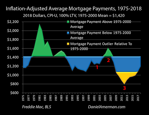
When we combine mortgage interest rates with inflation-adjusted housing prices, then we get the inflation-adjusted average mortgage payments in the fifth graph above, which uses the same blue / green / gold color scheme as most of the preceding graphs.
The great majority of home buyers do not pay cash, but use mortgages to cover most of the cost of their purchase. It is the price of the house and the mortgage rate in combination that determine the mortgage payment, how much cash has to be paid out each month, and whether that is affordable relative to the cash coming in each month.
When we look at the red numeral "1" during the time that the damage from the tech stock bubble collapse and the resulting recession were being contained - we do not seen an outlier golden area, but there is nonetheless a great deal of information value there. In the 2001 to 2004 time period when we look at the Home Prices graph we see the largest housing price gains on record at that time, with inflation adjusted prices growing to 45% above the long-term 1975-2000 mean - but for the average person, they never saw the financial disadvantage of the higher prices.
The golden outlier of mortgage rates on the Mortgage Rates graph that were entirely outside the historical range was so financially powerful that they more than offset the towering golden spike of outlier housing prices in the Home Prices graph. As shown in the blue area of the inflation-adjusted Mortgage Payments graph above, payments remained below average the entire time that home prices were surging 4.5X above their previous upper limit.
Yes, there were numerous bad decisions and policies that helped create the housing bubble of the 2001 to 2006 era, and its subsequent catastrophic failure. I have written about some of them extensively in the past, and as a former investment banker who used to structure the early generation mortgage derivative securities in the form of CMO/REMICs in the 1980s, and who literally "wrote the book" for McGraw-Hill in the form of a reference book on mortgage derivatives in the mid 1990s, I was frequently and loudly warning readers of the dangers before 2008 and right through the crisis.
Those factors are beyond the scope of this particular analysis - but for most part, they could not have happened in isolation. When we look at things like subprime lending with zero down, "liar's loans", flipping houses as the new investment mania, and the explosive growth of subprime and other mortgage derivatives even as underwriting and rating standards were rapidly deteriorating (in practice) - like bacteria in a Petri dish, they all needed a fertile environment in which to grow.
The most fertile environment for financial excesses and mistakes is to be inside of an asset bubble while it is rapidly inflating. It is almost hard to do wrong in that very forgiving environment - so long as one is betting on the upside. Prices will continue to rapidly rise, most mistakes in beliefs or execution will be covered over by the overall rising market, and everyone can feel like a financial genius, even as ever more money and ever more investors are drawn in from the sidelines.
Fundamentally, what created that fertile "Petri dish", and what enabled the greatest real estate price gains and profits that we had experienced in the modern era - was an intervention from outside of the markets, which is sometimes referred to as "deus ex machina". An extraordinarily powerful outside agency - the Federal Reserve - for its own macroeconomic and monetary reasons and as part of a quite deliberate strategy that had nothing to do with the random walk of conventional investment theory or the real estate market specifically - forcibly intervened and smashed short term interest rates down to almost 50 year lows, creating the wide golden outlier area seen in the Fed Funds graph #2.
Even after adjusting for the extraordinarily fast expansion of yield curve spreads at that stage in the cycle (as seen in the Yield Curve graph #3), another form of golden outlier was formed, one which persists to this day, which is the lowest mortgage rates in the modern era, as seen in the Mortgage Rates graph #4.
What the mortgage rates historic outlier enabled is what could be called a variant of "free money". The previous constraint of rising mortgage payments cutting off the increases in home prices was gone. Instead, as home prices equaled their historic highs above the mean, then reached 2X that historic boundary, then 3X the historic boundary, and then 4X the previous outer boundary and beyond - it didn't matter. No matter how high the prices climbed, the inflation-adjusted mortgage payments were always in the blue area of historically below average, as shown in the Mortgage Payment graph.
For economic reasons and as part of a cycle, the Federal Reserve began rapidly increasing interest rates in the summer of 2004, and these increases continued through 2005 and into 2006. As this was happening, it is worth taking another look at the Yield Curve graph and the sheer steepness of the plunge in yield curve spreads in 2004 and 2005. This cyclical lowering of the spread between long term interest rates and short term interest rates was so powerful that it kept mortgage rates almost flat and at a near historic low through 2004 and 2005 (on an annual average basis), right through the midst of what would be a 3%+ increase in Fed Funds rates by the end of 2005.
However, by 2005 average inflation-adjusted home prices had reached $251,741 (in 2018 dollars), which was 58% above the 1975-2000 mean. In other words, prices reached a place where they were about 5.8X higher than the previous cyclical upper boundary, and this price outlier was so high that inflation-adjusted mortgage payments finally exceeded average, as can be seen in the Mortgage Payments graph. The average mortgage payment of $1,488 was only about 5% greater than the 1975-2000 average payment of $1,420, which was still a bargain for supporting prices that were 58% above average, but the "free money" era was over.
The year 2006 was the peak for real estate prices, but the average price of $258,334 represented only a minor increase over 2005, most of the gains had already occurred. However, even with the yield curve cyclically inverting in 2006 as a result of 10 year Treasury yields becoming lower than 2 year Treasury yields, changes in yield curve spreads were no longer sufficient to overcome what would then be a full 4.25% cyclical increase in Fed Funds rates (from 1% to 5.25%), and average annual mortgage rates would climb to 6.41% that year. The increases in prices and mortgage rates would together produce the moderate spike seen in the Mortgage Payment graph, with a payment that was 14% above average.
The Fed Funds increasing interest rate cycle finally overpowered the plunging yield curve spread cycle, and even in time of inversion, was sufficient to move mortgage payments materially above historical averages, and thereby replace the "free money" of below average mortgage payments that had enabled the historic spike in housing prices, with increasing affordability issues.
This decrease in affordability could not have come at a worse time for homeowners and real estate investors - but this timing was not the result of "Murphy's Law" or some unrelated coincidence as part of the "random walk" of conventional investment theory. Instead, it was baked right in and created by the same cyclical series of exogenous interventions by the Federal Reserve, the same deliberate and understandable economic and monetary strategy, that produced the greatest real estate price increases of our lifetimes.
Real estate prices would begin their fall in 2007, and the financial crisis of 2008 would arrive in two years.
A Model That Better Fits The Data
This has been one of my most ambitious analyses to date, and it is my hope that the reader will better understand what has driven U.S. real estate prices in the 21st century, and why it is quite different from what we saw in the 1975-2000 period.
Real estate prices were a complete historic outlier in the 2001 to 2006 period, they worked in an entirely different way than they had previously. By themselves - the prices just broke the rules and made no sense at all.
However, a logical and self-consistent explanation appears when we combine 1) the Home Price graph with its outliers; 2) the Fed Funds rate graph with its cycles and outliers; 3) the Yield Curve graph with its cycles; 4) the Mortgage Rates graph with its outliers; and 5) the Mortgage Payments graph.
When we look at the extraordinary intervention by the Federal Reserve in smashing short term interest rates down to near 50 year lows, combine that with the related yield curve spread cycle, look at impact on mortgage rates, and then what happens to mortgage payments - the surge in housing prices makes sense, the peak in housing prices makes sense, and the setting of the stage for the next part of the cycle makes sense as well.
The reason for studying these relationships is not just history, but the current second golden spike above, identified with the red numeral "3". The world has not returned to the blue and green normality of the 1975-2000 period, but rather far from it. Instead, all five of the factors covered in the five graphs are in motion again, as the Fed continues to raise interest rates even while the yield curve nears another potential inversion.
Understanding the relationships between cyclical central banking monetary policy changes, cyclical yield curve changes, and how they impact mortgage rates and inflation-adjusted mortgage payments is not how most people approach evaluating real estate prices - but perhaps in this day and age of unprecedented "deus ex machina" Federal Reserve interventions, they need to be a core part of the process. Whether your interest is that of a homeowner, income property owner or REIT investor, I hope that you have found fresh perspectives and useful information in this analysis.
Seeing Opportunities In Unexpected Places
My other main goal was to examine in great detail a real world example of something that is counter-intuitive to most people: how the future containment of crisis can create some of the greatest wealth creation opportunities of our lifetimes.
Yes, I know - that sounds completely upside down. Crisis is a bad thing. The "containment of crisis" (whatever that is) sounds very bleak and pessimistic as well. Believing that the future could include cycles of some of the highest investment prices in history seems like an act of almost pure optimism, and common sense would seem to say that it should be the direct opposite of what those cynics and pessimists who talk about future recessions and crises would believe in.
But, yet... this entire analysis was about the containment of crisis. And how it ended up producing an almost miraculous (albeit temporary) increase in real estate wealth for a nation.
What started the explosive growth in real estate prices was a market crisis - the collapse of the tech stock bubble, with the associated catastrophic investment losses for millions of investors. That was a pretty awful event.
The massive market losses precipitated a recession with surging unemployment and a shrinking economy. Again, this is some very bleak stuff, and it could have lasted for years if something hadn't been done about it. So, those were two downright terrible events in combination, particularly for those who first lost their life savings - and then lost their jobs.
In that terribly bad set of circumstances, the Fed used its ultimate weapon, and to a degree that not been seen in many decades. In the effort to escape the recession that had been precipitated by the asset bubble collapse, the Federal Reserve swiftly knocked interest rates down to almost fifty year lows.
However, the world had changed greatly in fifty years, and this time the hammer blow landed in the modern era, a time when pervasive disintermediation and financialization had created new and powerful links between the housing, mortgage and overall investment markets that simply had not existed in the 1950s and before.
The last time the Federal Reserve had knocked the Fed Funds rates down to 1%, the mortgages used to buy homes were primarily financed by the local savings & loans. The permanent funding for those mortgages came primarily from the local communities themselves in the form of the money that residents had deposited in their savings accounts, and the interest rates paid on those savings accounts was capped by Regulation Q as a matter of law (and pervasive financial repression). It was an insular world, where the money came from the local community, it stayed in the local community, and the local mortgage and housing markets were largely shielded from the fees and the external volatility of New York, Wall Street and the capital markets.
So when the Fed smashed rates down to near fifty year lows in 2001 to 2003, it wasn't a repeat of a very long fifty year cycle, but rather something entirely new and different, something the world had literally never seen before. This time the enormous, market distorting effects of the Fed's exogenous intervention hit a world of electronically linked instant global financing, where a bewildering array of uncontrolled multi-trillion dollar financial experiments were being run simultaneously with regard to derivative securities, underwriting standards, statistical correlations, insurance viability, interest rate plays and volatility plays.
When that happened, all five of the graphs examined herein went spinning into motion - and they haven't stopped to this day. With the exception of the Yield Curve graph, the right side looks vastly different from the left side on each of the other graphs.
We are in a new era for real estate prices and how they are determined - the old relationships are long gone.
And at the heart of this new era is how it started - a double calamity setting the five graphs in motion, and producing record real estate profits that were first 2X outside the boundaries of the historical constraints, and then 3X. 4X, 5X and 6X. With each of those fantastic new records being the logical byproducts of the bleak sounding "containment of crisis".
Cycles Of Crisis & The Containment Of Crisis
The radical changes in real estate prices and price movements since 2000 are a case study for how heavy-handed Federal Reserve interventions can transform markets - and completely invalidate decades of previous market history.
We are seeing some of the largest asset price gains in history. We have also seen some of the largest losses - and those could yet return.
These extraordinary changes simply cannot be seen or anticipated, when looking at residential housing prices during years before 2001. The past is gone.
While real estate is a unique market, and the specifics differ, these same changes at different point in the cycles also apply to all the other major investment categories, including stocks and bonds. The past is gone there as well, valuations have moved into entirely different places, and as we will be exploring in later chapters, what moves stock and bond prices has also changed.
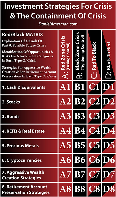
Using the framework of the Red/Black matrix developed in Chapter 1, this subject of this chapter can be found at the intersection of the "C" column, where Red Zone crisis is succeeded by the Black Zone containment of crisis, and investment category of row "4", which is that of the asset class of real estate. While this analysis focused purely on the 4th row, the same Red to Black cycle strongly impacted all of the rows, with the aggressive Federal Reserve interventions also changing stock, bond and precious metals prices in ways that were not part of normal historical patterns.
Learn more about the rest of the free book.
***************************************************
Read Chapter One Of "The Homeowner Wealth Formula"
Read Chapter One Of "The Eight Levels Of Homeowner Wealth Multiplication"