


Chapter One: A Visual Guide To The New Cycles For Stocks, Bonds, Homes & Gold
By Daniel R. Amerman, CFA
TweetStocks, bonds and homes account for the great majority of the net worth of most people - and all of these asset values were up by 30% to 50% between 2001 and 2019 when compared to long term averages (even after accounting for inflation).
As explored in this analysis, there is a shared reason for these much higher valuations. There is also a reasonable chance that they could eventually go much higher still, and perhaps persist for many years to come - though the path to that possible future would be a surprise to most people.
On the other hand, if we at any point merely return to the average valuations of most of our lifetimes, perhaps as a result of the economic shock produced by the coronavirus pandemic - then for many millions of households the long term consequences could be the loss of most or all of their home equity and much of the value of their retirement accounts.
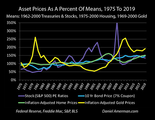
The graph above shows asset prices from 1975 to 2019, as a percent of the long term averages for each class before the year 2001. Whether we are looking at stocks, bonds, homes or gold - the trend lines are all up sharply since 2001, even in inflation-adjusted terms.
This perception is confirmed when we knock out the "zig-zags" by averaging the prices from 2001 to 2019 for each asset category, and then compare the results to the averages from 2000 and before, as shown in the graph below.
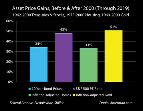
Each dollar of earnings for stocks in the S&P 500 is being valued by the markets as being worth almost 50% more, compared to the prior long term average.
Single family homes are worth about 33% more, even after adjusting for inflation and changes in home sizes. Equivalent ten year Treasury bonds are being valued as being worth an average of about 34% more.
And while gold is quite different from the other categories - it shares the dramatic increase in value since 2000, with the inflation-adjusted price per ounce being up by just over 50% compared to prior long term averages.
While the specifics vary widely on a year by year basis for each asset class, the dramatic average price increases for stocks, bonds, housing and gold are no coincidence. Instead, there is a common causality in play, and all can be traced to the same source - the unprecedented and heavy-handed policies that the Federal Reserve adopted in response to the asset bubble collapses of 2001 and 2008.
As we will individually explore for each major asset class in this analysis, we now have more volatile investment markets - and, on average, substantially higher valuations. With the Federal Reserve unleashing its most massive interventions yet in 2020, understanding the relationships between those interventions and asset prices becomes even more critically important for the years ahead. This includes seeing how asset prices in each category could eventually travel to still higher places - or what could quickly bring them back down to historic averages or below.
This analysis is the first chapter in a free book that is intended to provide a logical framework for understanding what has happened, and the potential future implications for each of the core asset categories of stocks, bonds, real estate and precious metals. An overview of the rest of the book is linked here.
A Record Of Volatility
In the last 20 or so years, we have seen in sequence:
1) The collapse of the tech stock bubble and the resulting recession;
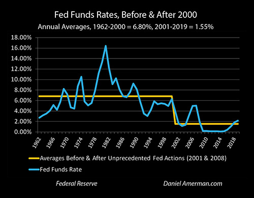
2) The Federal Reserve containing the crisis by forcing interest rates to 50 year lows, as can be seen in the graph above.
2) The growth of the real estate bubble that followed;
3) The Financial Crisis and Great Recession which followed the popping of the real estate bubble;
4) The Federal Reserve using zero percent interest rate policies to contain the damage from the popping of the real estate bubble - effectively wiping out the ability of retirees and retirement investors to earn interest income in the process;
5) The explosive subsequent growth in real estate and stock prices;
6) The threat to stock, bond and real estate prices when interest rates moved from very, very low in 2016 to very low in 2018 - causing the Fed to reverse course in 2019; and
7) A new round of economic crisis with the coronavirus pandemic of 2020.
This series of events was not random or inexplicable, but was the result of the United States moving through cycles of crisis and the containment of crisis, with an unprecedented degree of heavy-handed interventions by the Federal Reserve feeding the cycles and deeply distorting investment results.
The Extraordinary Interventions
Some people would say that the fall in interest rates is not a result of the Fed, but of a long term reduction in the rate of inflation.
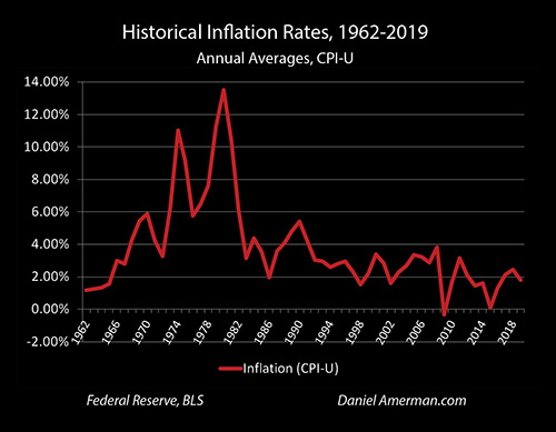
There is a certainly an element of truth to that belief. As can be seen in the graph above, rates of inflation have declined over the years, and the shape of the inflation graph does look quite a bit like the shape of the interest rate graph. To better understand the linkage, let's put the two side by side.
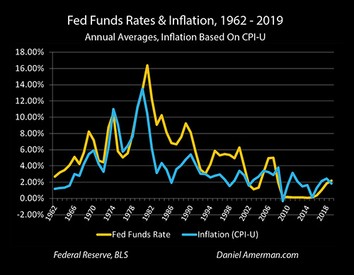
When we put inflation and Fed Funds rates side by side, we can see the general resemblance, but the specifics look quite different, before and after the crises of 2001 and 2008. With the exception of a short period in the 1970s when the Federal Reserve was losing control over inflation as it spiked upwards (and again around 1980 when the Fed was regaining control) short term interest rates were always higher than inflation.
This only make sense - what rational investor or market would voluntarily accept an interest rate that is lower than the rate of inflation? That would mean locking in a loss, and losing purchasing power every year.
However, when we look past 2001, and the two rounds of extraordinary Fed interventions - short term interest rates are often quite a bit lower than the rate of inflation.
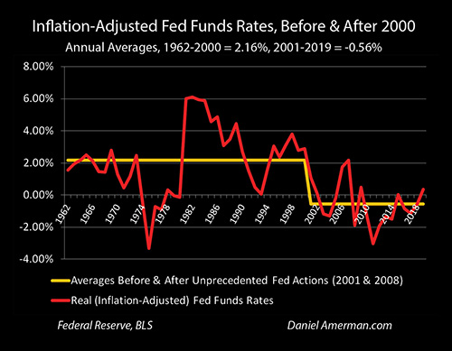
When economists and financial analysts are studying these relationships, they use tools like the graph above, which shows inflation-adjusted, or "real" interest rates. This rate is calculated by taking interest rates and subtracting inflation. If we have a 5% interest rate, and a 2% rate of inflation, so that our money is worth 2% less each year - then our real income, in terms of what our money will buy for us is 5% less 2%, or 3% per year.
If we look at the period during 1962 to 2000, before the crises and interventions, savers and investors rationally demanded that very short term interest rates be an average of 2.16% above the official rate of inflation (as can be seen by the height of the orange bar on the left). So they make at least a little money every year, that is only natural.
As inflation rose (on average) between 1962 and 1980, interest rates rose as well, but inflation-adjusted rates stayed positive, with the exception of the unnatural times during the peak of the inflationary crisis of the late 70s and early 80s. Now, when inflation dropped over the next 20 years, interest rates dropped as well, but they maintained their positive rate of return in inflation-adjusted terms, which is only logical and rational when self-interested investors are setting the rates.
However, since the first round of crisis in 2001, and particularly since the second round in 2008 - inflation-adjusted (real) interest rate have remained almost continuously negative. The average inflation-adjusted rate of return for short term savers from 2001 to 2019 was to lose 0.56% of the value of their money every year (as can be seen by the height of the orange bar on the right, and its position beneath the 0.00% percent level).
This has been a profoundly unnatural state when compared to previous decades - but it has also been entirely deliberate. Think back to the seven continuous years of zero percent interest rate policies between 2008 and 2015 - during the entire time, the Federal Reserve had the goal of inflation rates in the 2% or more range. So, for 7 years after the crisis, the openly stated policy of the Fed was to use its enormous monetary powers to force the unnatural state of a negative 2% inflation-adjusted interest rate on the entire nation.
Now, for many people, this bit about negative inflation-adjusted rates of return may be starting to sound a bit on the wonkish side. But if we go back to the graphs at the beginning of this analysis, and you want to understand why your house might be worth 30% more than it usually would be, or why a third or more of the value of your stock portfolio could be at risk of permanently disappearing in the coming years - what we are reviewing is a key component of the underlying sources.
We are not going to go into great detail in this first chapter. Instead we are going to take a very visual approach in identifying some of the key issues and how they can impact the average person and investor.
The next key step is to introduce why the Fed has been forcing interest rates downwards, and what this has to do with the crises.
Interest Rates & Containing Recessions
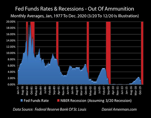
The blue area in the graph above is another graph of Fed Funds rates, this time from 1977. The red areas show when recessions occurred, and how long they lasted. Notice how - on average - interest rates fall dramatically every single time there is a recession.
This is policy, not a coincidence. The policy of the Federal Reserve when faced with a recession, or the likelihood of near term recession (this was very important in early 2019 and early 2020) is to rapidly force down interest rates.
As the coronavirus recession almost certainly arrives, the Federal Reserve had almost no interest rate "ammunition" to work with, and it used up all of that with the quick return to zero percent rates in March of 2020. As explored in later chapters - this means the past cannot repeat itself, so if there is another recession, then this is likely to lead to quite different performance for stocks, bonds, real estate and precious metals than what we have seen with the previous recessions in our lifetimes.
The graph above of Fed Funds rates shows one form of what is often referred to as the "risk free" rate, meaning that it is very short term and of the highest quality credit, so there is generally considered to be no price or default risk. When that investment valuation foundation changes - so does everything else in the investment universe.
One aspect is that lower risk free rates drive lower long term interest rates, lower mortgage rates, and lower stock dividend ratios. Indeed, when the Fed forces record lows at the foundation level of risk free rates, it also lowers the yields being demanded by investors for almost all investment types. This can then have an extremely powerful impact on bond prices, home prices and stock prices, all else being equal.
Major Changes In Stock Valuations
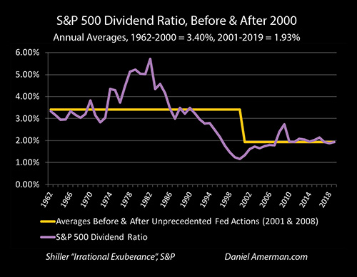
The graph above shows the dividend ratio of the S&P 500 over two time periods - the time from 1962 to 2000, and then the period from 2001 to 2019, which is our current cycles of crisis and the containment of crisis.
The dividend ratio graph is not identical, but has a general relationship with the Fed Funds rate graph - much higher dividends paid over most of our lifetimes and therefore much higher cash payouts for stock investors. However, there has been much less cash paid to investors since the two rounds of crisis. As can be seen with the orange bar, the average dividend ratio has fallen from 3.40% to 1.93%, which is a reduction of 43% in annual cash paid to investors (per dollar of share price).
Because the most stable feature of long term stock portfolio performance is not price changes but the reinvestment of cash dividends, this by itself is enough to fundamentally change the nature of stock investments, relative to long term averages.
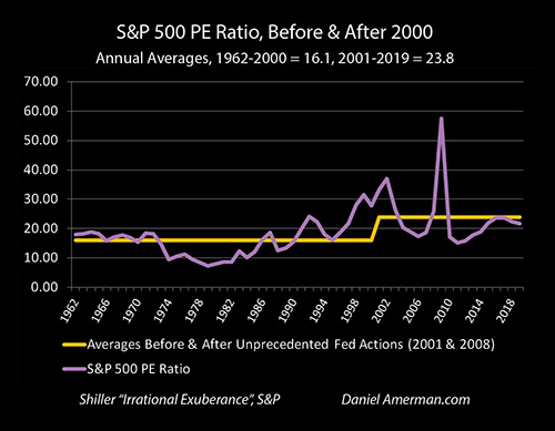
Earnings are not the same thing as dividends, but there is a strong relationship. The most followed measure of relative stock valuations is the price / earnings ratio, or PE ratio. This represents how much investors are willing to pay in terms of stock price for each dollar of reported earnings on the S&P 500.
In theory, the lower that the Federal Reserve drives rates, the more money that investors should be willing to pay for each dollar of corporate earnings. And if the Fed takes the radical measure of forcing interest rates well below the rate of inflation - then we should also see a radical increase in PE ratios.
As can be seen above, there was indeed in practice a dramatic change between the long term averages, and the averages during the subsequent cycles of crisis and the containment of crisis. For decades, the markets would not on average pay more than $16.1 for each dollar of corporate earnings. Since 2001, and the initial Fed-induced plunge to negative real interest rates, the markets have paid an average of $23.8 for each dollar in corporate earnings, which is an increase of 48% (and can be seen by the increase in the height of the orange bar).
It is also visually obvious that there has been a radical increase in the volatility of the PE ratio over the last 20 or so years, with annual degrees of gains and losses that are well outside of the historic norms.
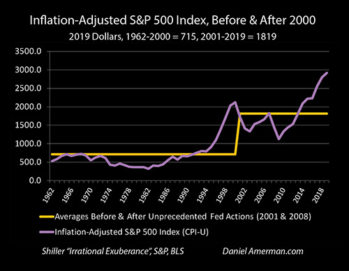
This increase in volatility is even more stunning when we look at the S&P 500 index in inflation-adjusted terms (2019 dollars). The wild gains during the inflation of the tech stock bubble, the floor falling out when the bubble popped, the rapid gains thereafter, the steep plunge with the 2008 crisis - and the jaw-dropping gains since that time - those are all outliers relative to previous long-term averages. (These are annual averages and don't yet include the extraordinary price movements that resulted from the coronavirus pandemic.)
The stock market is clearly behaving in a very different manner than before - with a far greater potential for sizzling price gains - and a far greater exposure to precipitous price losses. That said, as can be seen when we look at the orange bar, the average inflation-adjusted price for the S&P 500 has risen from 702 during the 1962-2000 era, to an average of 1,819 since that time, which is an increase of 159%, even after including the severe losses associated with both asset bubbles popping and both bear markets.
Major Changes In Bond Valuations
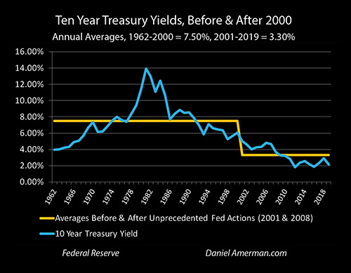
Long term interest rates are not the same thing as short term interest rates, but there is a very strong relationship. When we look at the yields on ten year U.S. Treasury obligations, they are somewhat higher than the overnight Fed Funds rates, but there is a strong resemblance between the graphs.
As shown above, the long term average between 1962 and 2000 was for investors to be able to earn a 7.50% yield - with no credit risk - simply by buying the ten year full faith and credit debt obligations of the United States government. As explored in later chapters, this created a reliable method for using compound interest to build wealth (even in inflation-adjusted terms), that is unfortunately, long gone for savers and investors at this point.
Instead, because of the Federal Reserve interventions, the average yield fell to only 3.30% for the period between 2001 and 2019, as can be seen with the orange bar above.
This loss of the traditional power of compound interest is most unfortunate - but there is a flip side. As sophisticated institutional investors know quite well, but far fewer individual investors realize, long term U.S. Treasury bonds can be a very powerful method of profiting from recessions, and from cycles of crisis and the containment of crisis.
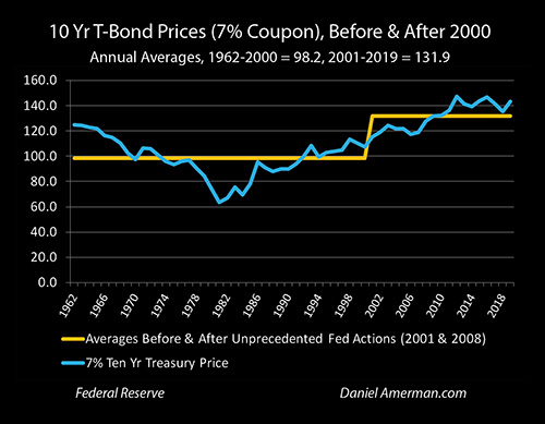
What the above graph shows is the average annual price for a ten year Treasury obligation with a 7% coupon. During the prior decades, because the average yield was 7.50%, such a bond would have traded at a discount, an average price of a little over 98 cents on the dollar. However, since the Fed began its cycles of radical interventions and forced short term rates below the rate of inflation - the value of a Treasury obligation with a 7% interest coupon has increased vastly.
On average, during the 2001 to 2019 period, the price for such a bond rose to about 132 cents on the dollar, as can be seen with the orange bar. This represents an increase of 34% over long term averages.
Now, where things get really interesting - and important - is when we compare the lines of the annual averages - and the orange bars - between stocks as represented by the S&P 500 PE ratio, and 10 year Treasuries. In broad strokes, as seen by the orange bars, the average outcome has a great deal of similarity, with much higher prices for stocks and bonds than the historic norms, as the quite logical result of the Fed forcing real interest rates far below historic norms. There is also a lot of volatility that has been a part of that process, in each case.
However, as is visually obvious if one scrolls back and forth between the asset category graphs - the annual specifics of these enhanced gyrations, how stock prices and bond prices respond to the different phases of crisis and the containment of crisis are entirely different. So both risks and opportunities are shifting back and forth between stocks and bonds at different stages, depending on where we are in the cycles relative to the crises and the containment of crisis. The shifting and the timing of the shifts is once again likely to be of critical importance with the 3rd cycle of crisis that has been triggered by the coronavirus pandemic.
Major Changes In Housing Valuations
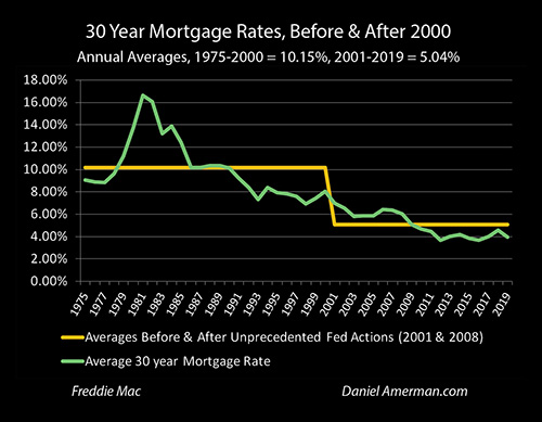
The thirty year mortgages often used to finance home purchases in the United States carry rates that are priced at a spread above ten year Treasury yields. So it is no surprise that the shape of the mortgage rate graph above is not only generally similar to the prior Fed Funds rate graph, but is even more similar to the graph of ten year Treasury yields.
While people invest in Treasuries - they buy homes with mortgages, either as personal residences or investment properties. If we look at the orange bar - mortgage rates fell from a long term average of 10.15% between 1975 and 2000, down to less than half that amount, or 5.04% between 2001 and 2019 (the earlier years are different than with stocks or bonds for database reasons).
Now, if mortgage rates drop by half as a result of extreme Federal Reserve measures for crisis containment - then the average person can afford to pay a lot more for a house, and we could expect housing prices to rise substantially, all else being equal.
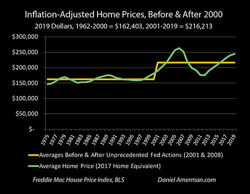
When we track changes in housing prices as seen in the graph above - then that expected relationship is exactly what we get. Since the Fed first slammed interest rates down to contain the damage from the tech stock bubble collapse and the resulting recession - housing prices for equivalent homes have broken completely out of their historical range. Indeed, home prices are up by an average of about 33%, even after adjusting for inflation and changes in average home sizes.
What is also quite notable is the radical increase in the volatility of home prices, in response to the Fed's new generation monetary policies. Housing used to be quite stable in inflation-adjusted terms, but we have had instead the soaring heights of the real estate bubble, that was followed by the greatest crash in modern real estate history, that has been followed by another rapid increase in real estate prices, that has moved well above historic norms in a way that bears an almost uncanny resemblance to the first round.
When we add housing to the mix, then the comparisons with stocks and bonds grow even more interesting - and more important. Add up stock values, bond prices and home values - and one has the great majority of the net worth of most of the households in the United States. Looking at the orange bars of 2001-2019 - then houses are up 33% (inflation-adjusted), ten year bonds are up 34% and the PE ratio of the S&P 500 is up by 48%, when compared to each of their prior long term norms.
So, when the average person (likely including the reader of this analysis) adds up the value of their assets, the valuations they currently see could be up by 30% to 50% as a more or less direct result of the extraordinary policies pursued by the Federal Reserve since 2001.
However, the annual specifics of these much larger price swings on the way to higher overall averages are very different for housing, than they were with either stocks or bonds. So we have what are the three largest asset categories for most of the population, the values of which are all gyrating up and down in response to outside interventions that are not part of 20th century averages - but which vary widely for each asset category, depending on the particulars of where we are in the cycles.
Major Changes In Gold Valuations
Gold and other precious metals are often described as being inflation hedges, and stable stores of value. So, all else being equal, we would expect there to be a strong relationship between the inflation chart above, and the value of gold.
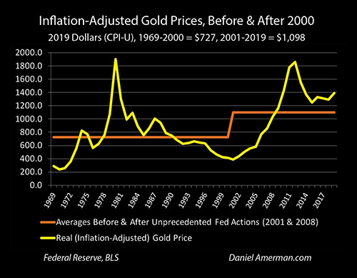
That relationship is not perfect, but there does seem to be a correlation on the left sides of the graphs. However, that is not at all what we have been seeing since 2001. We are seeing what are supposed to be the lowest rates of inflation of the modern era. Yet, as seen in the graph above, we have been seeing what are on average unusually high gold prices in inflation-adjusted terms.
Now, the explanations are more complex than what can be covered in this brief visual overview - but there is a strong case to be made that gold has been acting as a crisis hedge instead of an inflation hedge. Because crisis hedges are much less common (and more valuable) than mere inflation hedges, this means that the case for "gold as insurance" can be much stronger than many investors realize - but it is also quite different than the most common perceptions of what role precious metals can perform in a portfolio.
There are two points about average gold prices over the last 20 or so years that are particularly worthy of note. One is that while gold is a very different type of investment - the change in the height of the orange bars before and after the year 2000 is surprisingly similar. The inflation-adjusted price for an ounce of gold from 2001 to 2019 is up 51% compared to its previous long term average (from 1969 in this case).
However, while the average increase in inflation-adjusted asset valuation falls in the same range - the annual specifics of the gyrations are entirely different for gold than with any of the other asset classes. So we have four different major asset categories, the averages for all four them are all up sharply since the cycles of crisis and the containment of crisis began - but the specifics for when each asset class rises and when it falls during the cycles are each quite different.
Seeing The Opportunities Along With The Risks
Over the last 20 or so years we have seen: the stock asset bubble... crisis... the Fed slamming rates down to 50 year lows to contain crisis... unusually high asset prices... the real estate asset bubble... a much worse crisis... the Fed slamming interest rates down to the lowest levels in history to contain that worse crisis... some of the highest average asset prices in history... potential asset bubbles...???
Is that a pattern? Could it happen again? Is it happening again with the coronavirus pandemic creating a 3rd cycle of crisis?
From a mainstream financial planning perspective, each of those extraordinary events came as complete shocks and surprises; they were abnormalities that never should have happened.
The traditional alternative to the mainstream is a "gloom and doom" perspective, and from that viewpoint, the last almost twenty years have also been deeply abnormal. The crises are now expected, but it is the record high prices for stocks, bonds and real estate - rather than the expected monetary collapse - that are the unexpected abnormalities.
In most fields, if we have to disregard most of the data for the last 20 years because it doesn't fit the model, then a question should arise - are we using the right model? And if the subject is important - such as the value of our life savings and potential standard of living for what could be decades of retirement - then shouldn't we be insisting on a model that actually fits the data, instead of ignoring decades of recent data as being "abnormalities"?
However, when we take a cyclical perspective - which could be a really good idea with a 3rd cycle of crisis underway and a 3rd cycle of the attempted containment of crisis to follow - then the abnormalities disappear and the data far better fits the model.
The sharp losses caused by the popping of asset bubbles and market crises become rational and expected. Federal Reserve interventions and the destruction of interest income for retirement investors becomes rational and expected.
Most importantly, the "orange bars" and the record or near record prices for stocks, bonds, real estate and precious metals all become rational and expected at various points in the cycle.
The last twenty years have included some of the worst financial conditions that most of us have experienced in our lifetimes. The last twenty years have also included some of the most profitable market conditions that we have ever seen.
Both are true simultaneously - and there is good reason to think that both could potentially be true in the future. To protect ourselves from the risks and to position ourselves to profit from the opportunities, we have to be able to truly see and understand the logical relationships between crisis, the containment of crisis, and investment price movements in each of the major asset categories.
Better Understanding The New Cycles
Let me suggest that there are three particularly important considerations when it comes to the investment implications of the new cycles.
1) As reviewed herein, the Fed's actions to date have helped to create amplified price gains and higher average prices across all four asset categories - although the path is different for each asset category. With a 3rd cycle of crisis and recession being the likely result of the coronavirus pandemic - there is a chance that the continuation of this process with a 3rd cycle of the containment of crisis could eventually lead to the highest asset prices yet.
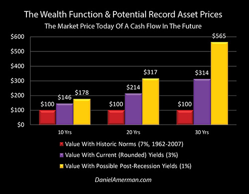
The paths there could be the most volatile yet, and major losses could hit multiple categories. But yet, as explored in later chapters, a future containment of crisis could eventually lead to the highest asset prices yet, as shown in the golden bars in the graph above. These prices could persist for many years, and form one of the most important events in a lifetime of investing.
2) The new cycle of “deus ex machina” market interventions also creates amplified losses at some points in the underlying business cycle, for reasons that are not part of traditional investment theory or financial planning. When these losses occur also varies by asset category.
There is another issue that goes beyond mere higher volatility, however, and that is what happens if there is a reversion to the mean, i.e. a return to long term investment valuations for stocks, bonds, real estate and/or gold.
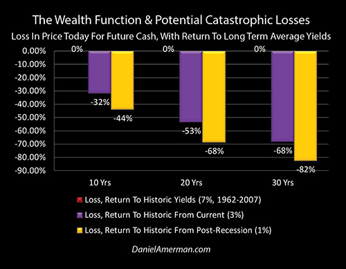
As explored in later chapters, the problem with having asset prices that are far above historic norms is the necessary losses if we ever... merely... return to the long term averages. As explored in later chapters and shown above, a return to historic average valuations for stock earnings, bonds and home prices could lead to crippling losses that could become "permanent" for most investors and homeowners (in inflation-adjusted terms).
3) Most importantly, the amplified losses and amplified profits that result from these new cycles are not random but can be at least partially anticipated in advance through understanding the double trap (of its own making) that the Federal Reserve is now caught in over the long term, and anticipating the market effects of the known strategies that the Fed has been using in the past and/or intends to use in the future.
Because I believe the Fed’s increasingly heavy-handed interventions have created cycles of crisis and the containment of crisis which are very important for individuals to understand, I created the framework below to help explain how these new changes in the cycles can change investment category results at various stage in the cycles.
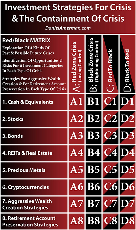
The core of the matrix is the columns, which are the color-coded cycles of crisis and the containment of crisis. The Red "A" column represents a cycle of crisis. The Black "B" column represents a cycle of the containment of crisis. The Red/Black "C" column is the cyclical movement from crisis to the containment of crisis. The Black/Red "D" column is the cyclical movement from the containment of crisis back into crisis.
The first six rows are the investment categories at each place in the cycles, with the implications for risks and returns in that category. The six rows are 1) cash & equivalents; 2) stocks; 3) bonds; 4) REITs & real estate; 5) precious metals; and 6) cryptocurrencies.
Further developing the logical relationships between the cycles and the investment categories, and how amplified gains and losses jump from matrix cell to matrix cell as the cycles progress, is the goal of the following chapters.