


Is Traditional Financial Planning Blind To The New Sources Of Profits?
By Daniel R. Amerman, CFA
TweetSome investors are concerned that the future holds new risks which traditional financial planning strategies do not adequately take into account, and that this could lead to substantial underperformance in practice over the long term.
In this detailed financial analysis of the United States real estate market from 1975 to 2017, we will explore a quite different kind of risk with traditional financial planning - which is the inability to identify profits that can greatly exceed historical averages.
This analysis is part of a series of related analyses, an overview of the rest of the series is linked here.
A Concrete Example Of Models That Don't Fit The Data
The basis of traditional financial planning is Modern Portfolio Theory, which was developed in the second half of the 20th century. Historical performance was intensely analyzed in numerous studies, and relative risks and returns were identified for stocks, bonds, precious metals, and real estate.
These studies are the basis of most financial planning. Indeed, while it is not usually described in this manner, the usual underlying assumption when it comes to making investment decisions is that we can confidently rely upon the past to essentially repeat itself, over and over and over again into the indefinite future - at least in terms of the broad strokes over the long term.
As conceptually developed in the analysis "A Model That Better Fits The Data" (linked here), there have been big problems in practice when it comes to the last twenty years or so. Two asset bubbles collapsed, there was the Financial Crisis of 2008 that was followed by the Great Recession, there have been record increases in the national debt, and we've had an unprecedented degree of central banking (Federal Reserve) interventions that involved creating trillions of dollars out of the nothingness as well as forcing historically low interest rates.
In this analysis we will explore in practice what the results were for one asset category, that of real estate, and see whether the actual profits and risks were what they were supposed to be.
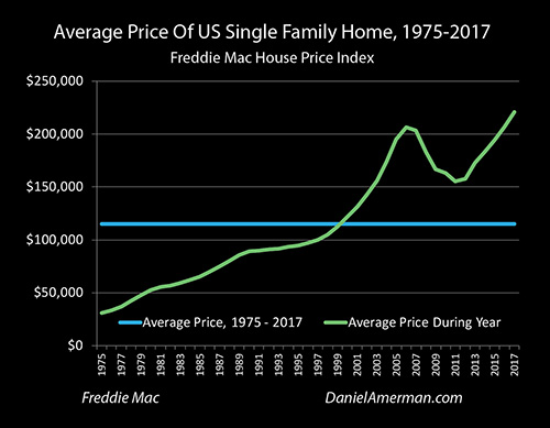
The graphic above shows the average price of single family homes in the United States between 1975 and 2017. The main data source is the Freddie Mac House Price Index, which has been calculated for every state as well as the nation as a whole since 1975. This is a much broader index than the better known Case-Schiller index which tracks only the 20 largest metropolitan areas. Like the Case-Schiller it uses a pair-based methodology, which is necessary to separate house price appreciation for the same size houses from the steadily higher prices associated with steadily larger average home sizes over the years.
To provide a dollar price, the average median single family residence sales price of $220,958 for 2017 as calculated by Zillow was used. When adjusted for the Freddie Mac index (which is not expressed in dollar terms), annual average historical prices were generated back to 1975, when the average 2017 sized home would have sold for $30,874.
(Average home prices in 1975 were actually quite a bit less, because the average home was quite a bit smaller than today, so we have to use a "like to like" pairs-based index that takes this into account such as Freddie Mac or Case-Schiller. However, the need for such an index means that it is much more difficult to analyze national real estate price changes before 1975 than is the case with stocks or bonds.)
As is visually obvious, the price trend is sharply upwards over the years, with the average house experiencing over a 7X increase in market value. It can also be seen that by 2016 average national home prices ($206,709) had reached the same levels seen at the height of the real estate bubble in 2006 ($206,386), and that 2017 sales prices represent an all-time record for single family homes.
However, the graph shares a problem with many other long term financial graphs, and this is what it is mostly showing is a decline in the value of the dollar. Most of our 7X increase in home values results from the dollar having about 4.5X the purchasing power in 1975 compared to what it does today.
Using Inflation-Adjusted Dollars To See The Patterns Of The Past
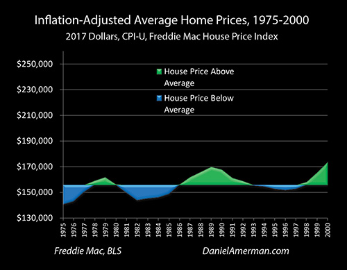
The graph above shows inflation-adjusted average home prices during the years 1975 to 2000, based upon the average purchasing power of the dollar in 2017. The Consumer Price Index (CPI-U) as reported by the Bureau of Labor Statistics is used to calculate the purchasing power of the dollar in each year. The graph ends in 2000, so it does not include the recession of 2001 that resulted from the collapse of the tech stock bubble, and set off the series of increasingly powerful Federal Reserve interventions that persist to this day.
What can be seen above is one example of the patterns of the past that form the foundation for traditional retirement and other long-term investment strategies. In this case it happens to be real estate in the form of single family homes, there are different patterns for the other investment categories.
The average (mean in this case) of inflation-adjusted home prices over those years is $155,668. Whenever the annual home price went above the average it is shown in green, and whenever it goes below it is shown in blue. Studying the graph we can see the "metrics" for how we should expect an investment in single family homes to perform:
1) Home prices oscillated up and down over the mean value, and the classic strategy of investing for a reversion to the mean would have worked over those years. Buy in the blue areas when inflation-adjusted home prices are low relative to the average, wait until time takes us into a green area where prices are high relative to the average, and then sell, in order to achieve results that exceed the rate of inflation.
2) The inflation-adjusted changes in price are relatively minor compared to some other asset categories, meaning that single family homes could be considered a relatively stable investment. The entire range of annual averages was from a low of $140,668 to a high of $173,436. The low never went more than 10% below the average, and the high peaked at 11% above the average.
3) The rate of change in inflation-adjusted prices is quite slow, taking years to oscillate up and down from peaks to troughs. As an example, it took seven years for the average house to gain a little more than $25,000 in value between 1982 and 1989, and then it took another seven years for the market to give back $18,000 of those gains by the year 1996.
So when we take the traditional approach of studying the past and then projecting those results forwards into the future, then owning a home as residence and/or investment can with a high degree of certainty be projected to be a highly stable investment that oscillates around a mean. They should always stay within a range of roughly +/- 10% to the long term average of $155,668, changes in price should be gradual, and while the upside potential is quite low, so too is the exposure to the downside.
It is worth noting that because the inflation-adjusted annual value changes were so low, inflation was almost always enough to more than offset any real losses, So when we look at nominal dollars as shown in the top graph, with the exception of 1988 when the average national price of a home fell by a mere $7, every other year saw nominal (not adjusted for inflation) home prices rising over the year before.
While there were obviously exceptions for individual homes or regions, on a national basis the problem of going significantly "underwater" and having the house be worth less than the mortgage simply didn't exist. Indeed, based on the best available historical data and metrics by the year 2000, it would have been entirely reasonable for experts to assert with confidence that a national crisis with deeply underwater homes would be so unlikely as to be almost impossible.
Profits & Losses That Broke The Historical Patterns
So how have the well-established 20th century patterns governing home prices held up in the 21st century so far? The graphic below extends inflation-adjusted home prices through 2017, and adds a gold area to represent house prices that are historical outliers, meaning the value is entirely outside of the range experienced between 1975 and 2000.
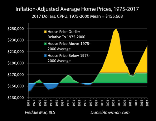
As is boldly visually obvious - there has been a complete model failure when it comes to depending upon the past to give us a reliable means of anticipating future risks and returns. Most of the surface area in the graph is now gold, meaning that almost all of what we have seen in practice since 2000 is an outlier, something entirely outside of what was experienced in the past.
By 2006, average home prices had risen to $250,939 (in 2017 dollars), which was a little less than $100,000 above the long term average. This was a 61% increase from the average, meaning it was about 6X greater than the about +/- 10% range it was supposed to fall in.
Between 2006 and 2011 home prices fell by almost $82,000. Compared to the average price of $155,668, this was a 53% change, or about 5X greater than the +/- 10% range it was supposed to stay within. As previously noted, based upon the data from 1975 to 2000 the chances of an event like this happening and the resulting millions of underwater mortgages should have been close to statistically impossible - but it did happen, and to a degree that was far outside the previous patterns of risk and return.
Now, one could say that this was all the result of a one time anomaly, the expansion and collapse of the real estate bubble, but as is visibly obvious, that is not the case. Even at the bottom of the trough in 2011 and 2012, for the first time, average home prices did not revert to the mean.
The long term relationship completely fell apart, and after two years of what were over the long term still some of highest real estate prices on record, the direction reversed, and single family homes began another swift trip upwards.
When we adjust for inflation, then 2017 was no longer a new peak, as the average house was still worth about $30,000 less than the 2006 high. However, the fast climbing prices are still about $65,000 above the 1975-2000 average, which is 42% above that average, or about 4X the previous maximum price increases.
So, it is not just the first golden spike, the trip up and down with the real estate bubble that was entirely outside the prior historical range. As can be plainly seen, everything since then has also been a direct contradiction of historical experience, with no reversion to the mean, and then a second swift round of price increases creating a second golden spike that exceeds the outer limits of the former historical patterns by a factor of four (so far).
A Model That Is Blind To Extraordinary Profits
The purpose of this analysis was to examine for one asset category - single family residences in the United States - the validity of the near universal financial planning assumption that the risks, returns, patterns and metrics of the financial past can be used as a reasonably reliable guide for making decisions about the financial future.
Our result was a complete model failure. The previously highly reliable patterns and metrics of the past proved worthless - and indeed even dangerously misleading - as a guide to what would actually happen in the future. However, the most interesting information of all can be found in the specifics of how the model failed.
We've had two really bad financial and economic events happen since 2000, with each being abnormally negative outliers from the perspective of most traditional retirement and financial planning strategies. There were the catastrophic investment losses for many investors from the tech stock bubble popping and also from the Financial Crisis of 2008. There was the resulting recession of 2001, and the Great Recession of 2008 to 2009, which was the worst for the United States economy since the Great Depression of the 1930s.
So, given two extremely bad events, most people would naturally assume that if the financial models were to break, then it should be to the downside. If the change from the past is having multiple market crises and economic devastation - then the way most people see the world, we should have seen devastating real estate losses, outside of any experienced in the past.
But, that isn't at all what happened. Instead, the direct opposite happened.
If one looks at the golden surface area of the outliers, they are without exception to the upside. How the real estate markets reacted to some of the worst financial and economic news of our lifetimes was to create two towering spikes of extraordinary profits, that were completely outside the bounds of what was reasonable to expect based upon the past.
The conventional wisdom did not fail in missing the losses - it failed in missing the profits.
And yes, the crippling real estate losses of 2006 to 2011 were financially devastating and even life changing for many millions of people. But what needs to be recognized is that almost all of the prices involved over those years were either outliers to the upside, or at the very upper range of previous inflation-adjusted housing prices. So it wasn't that real estate ever even got below average, but rather there was a swift - and quite temporary - decline in the extent to which prices were far above average.
Most importantly, in addition to real estate, since the year 2000 we have also seen record or near record valuations for stocks, bonds and precious metals.
It is very difficult to explain many of these valuations from the perspective of traditional financial planning for retirement, or from the traditional alternative to that, which is a "doom & gloom" perspective. The data we have experienced just doesn't fit the models.
There is an alternative which is to view these valuations as being the result not of crisis - but the containment of crisis.

(Red/Black matrix pdf link here.)
The information presented in this analysis is one aspect of an extensive body of work that has been under development for many years, and the Red/Black matrix above provides a conceptual overview of how the pieces fit together. This particular financial analysis falls in the subject category of matrix row 4, "REITs & Real Estate", and cells A4, B4, C4 and D4.
This analysis is now long enough, and this is a good place to end this stage. In subsequent analyses I will build upon this analysis and do some further work with matrix row 4, exploring why what we have seen with historically abnormal real estate prices is the entirely logical result of the serial containments of crisis, as well as some implications for future investment performance that would be very difficult to see from the perspectives of traditional retirement financial planning or from a "doom & gloom" approach.
*******************************