


Next Recession: The Case For A 36% Stock Market Loss
By Daniel R. Amerman, CFA
TweetIf there is a recession in the next one to two years, there is also likely to be another bear market for stocks. Based on their experience over their lifetimes, many investors are expecting a "normal" bear market in that event, perhaps in the 20% to 25% range in terms of losses.
However, we are not in normal times, and we have seen a fundamental change in stock valuations over the last more than twenty years. We have also seen a major change in the losses experienced in bear markets, relative to prior decades.
This analysis takes a detailed visual look at the history of the S&P 500 stock index since 1962, and shows how the fundamentals have changed since the mid 1990s. Using simple averages, it then shows why the base case for a new bear market could be a two year inflation-adjusted loss of 36%, which would exceed anything experienced in the 1960s, 1980s or 1990s.
This analysis is part of a series of related analyses, an overview of the rest of the series is linked here.
A Change In The Patterns
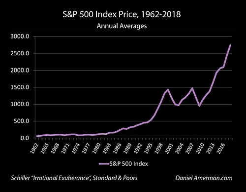
Let's begin by taking a look at the S&P 500 index the way that most people do - which is simply the index values over time. In this case, we are using annual averages from 1962 to 2018, which smooths out some of the daily and monthly fluctuations.
The index moves from 62 in 1962, to 541 by 1995, to an average of 2,745 for the year 2018. What is of particular note is the markedly more jagged nature of the index after 1995, with much steeper increases during the good times - and much steeper losses during recessions and bear markets.
Of course, part of the climb in the S&P 500 as well as the larger profits and losses is no more than inflation. The purchasing power of a dollar in 1962 was about 8.2X greater than it was in 2018, and about 1.6X greater in 1995. So, if we strip out inflation - does the period after around 1995 still look so different from the prior decades?
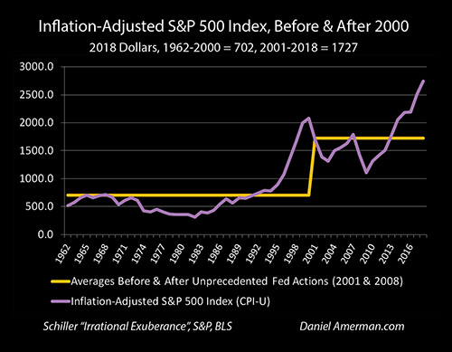
When we look at the S&P 500 in inflation-adjusted terms - the post 1995 changes are not smoothed out, but become even more prominent instead. Prior to 1995, much of what appeared to be consistent stock market index gains turns out to be flat or even declining markets, which are masked by the steady erosion of the purchasing power of the U.S. dollar.
The 1995 to 2018 era has in general been a time of lower reported inflation - which means the larger gains and losses are much less of an illusion. The run up in values during the growth of the tech stock bubble is stunning - there was nothing previously like it. The sharp jag upwards in the stock market from 2003 to 2007 is also clearly outside of historical norms.
The current stock market gains (starting in 2010) can also clearly be seen for what they are - an almost off the scale historical anomaly, which can only be compared with the 1995 to 2000 period.
It is also worth noting that the degree of losses has also been far higher than in previous decades. It is visually obvious that the inflation-adjusted losses in 2001 and 2002 far exceed those seen in any prior decades. Yet, what appears to be equally steep losses were seen again in 2008 and 2009, in the only other bear market / recession we have seen in the last 20 years.
Higher Asset Prices Across Multiple Markets
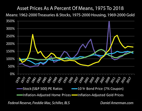
As developed in the previous 14 chapters of my current book in progress, we are indeed in a very different place when it comes to not just the stock markets, but the bond markets, real estate markets and precious metals markets as well.
The stock market led the way for the change in the markets - and has also been transformed by that change.
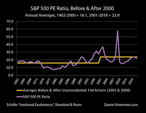
As can be seen above, PE ratios exploded upwards as part of the growth of the tech stock bubble, and went completely outside of the historical range in the latter half of the 1990s through the year 2000. This increase in PE ratios created a "higher high" which set the stage for the single most devastating loss in the S&P 500 since the great depression of the 1930s.
The Fed responded by slamming interest rates down to 50 year lows, with the Fed Funds rate going under 1.0% for the first time since the 1950s. As covered in previous chapters, this set in motion cycles of crisis and the containment of crisis. The extremely low rates used to contain that first crisis created the lowest mortgage rates in decades as well, and fed the real estate bubble, which also fed the next sharp increase in the stock markets.
Those elevated heights then set up a historically abnormal crash in 2008 - which the Fed responded to with the lowest interest rates in history, in the attempt to contain crisis. The financial mathematics is beyond the scope of this one analysis, but very low interest rates should create materially higher PE ratios, all else being equal. And as can be seen above, since 2001 PE ratios have averaged 23.9, which is almost 50% higher than the 16.1 of the 1962 to 2000 period.
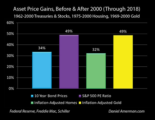
Indeed, when we look at all four major investment categories of bonds, stocks, housing and gold, then our inflation-adjusted asset prices are up by 32% to 49% as a direct result of the cycles of crisis and the containment of crisis.
Higher Highs Mean Greater Losses
Higher heights mean greater declines in the event of adversity, all else being equal.
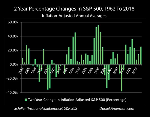
These greater declines can be seen in the graph above, which looks at two year changes in the S&P 500, on an inflation-adjusted basis. (In annual terms, the 2001-2002 and 2008-2009 bear market losses were each mainly 2 year events).
During a time of elevated stock valuations and elevated PE ratios we had two particularly severe bear markets. There is again a strong element of common sense here - abnormally high stock market valuations should indeed be vulnerable to abnormally large percentage declines in value during recessions and crashes (particularly when asset bubble collapses are involved), all else being equal.
There was nothing in the 1960s, 1980s or 1990s that was even remotely in the range of the two losses seen after 2000. (Part of this is that by taking a longer term approach and comparing twelve month averages over two year periods, we knock out the more shallow and fleeting of the historical bear markets.) To find comparables, we need to go back to the 1970s - and the worst investment markets over the long term that had been seen since the 1930s.
Clearly, there has been a major change in two related patterns. The stock markets (as illustrated with the S&P 500 index) are on average in an all new range for inflation-adjusted values and PE ratios. When these elevated valuations intersect with the recessions that are a normal part of the business cycle, then far larger losses are produced than was the norm for most prior decades.
Many investors seem to implicitly think that they can cherry pick the best of gains and losses, where they take prices that are abnormally high as being the new and natural norm, while expecting business cycle losses that merely the average of what we have seen over the long term with much lower valuations. That does not make sense from the perspective of either financial mathematics or common sense - and it is also not at all what history has shown us over these last couple decades of abnormally low interest rates and abnormally high asset prices.
Finding The Averages
So, if history (on average) repeats itself, what should we expect with the next recession and bear market?
A very simple and somewhat conservative approach is to take the smoothed average of the two previous stock market losses that we have experienced in these cycles of higher asset prices and high PE ratios. "Smoothed" because we are looking at annual to annual, instead of the worst case scenarios of highest daily high compared to lowest daily low.
The inflation-adjusted average value of the S&P 500 in 2000 was 2,081 (2018 dollars), and it fell to 1,391 by 2002, which was a 2 year decline of 33.2%.
The inflation-adjusted average value of the S&P 500 in 2007 was 1,788, and it fell to 1,107 by 2009, which was a 2 year decline of 38.1%.
A simple average of the 2 losses is 35.65%, which rounds to 36%.
On a simple basis then, this would imply that the base case scenario for the S&P 500 in the event of another recession would be about a 36% loss over about the two years or so after the peak year.
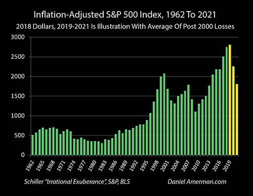
This simple average is illustrated above. The yellow bar for 2019 is the inflation-adjusted average of the S&P 500 for the first five months of 2019, which is 2,800, and that level is extrapolated forward for the entire year. The yellow bar for 2020 takes the average of the first year losses from 2001 and 2008, and shows an average value for 2020 of 2,252.
The yellow bar for 2021 takes the average of the two year losses, and shows an average value for the inflation-adjusted S&P 500 of 1,802 for the year 2021, which is a decline of 36% from the average for 2019.
Looking at the illustration graph, it is interesting to note that this new low would in inflation-adjusted terms be approximately equal to the high for the 2007 market, and well above the lows for the 2002 and 2009 markets. It would also be far above anything in the much flatter range seen between the early 1960s and mid 1990s.
Is the above a precise prediction or literal projection? Absolutely not - the future is unlikely to exactly equal the averages from the past. So whatever the values are - they are likely to be somewhat different in each year.
The point of the quite simplified illustration is to establish a reasonable base case expectation.
We are in an extraordinary time when it comes to interest rates and heavy-handed Federal Reserve interventions. This has produced higher asset values across all the major asset categories, and a quite different pattern for both PE ratios and inflation-adjusted valuation for the S&P 500 index.
The best data we have for this new environment is the previous two losses, each of which were exceptional by historic standards, and had no parallels in the 1960s, 1980s or 1990s. The simple average of those two outcomes, applied to current levels, would be a 36% two year loss in the S&P 500, and a decline in the index of almost exactly 1,000 points.
Now, we could look at some factors and argue that it will be less, We could look at other factors and argue that it could be worse, possibly much worse. Either way the 36% loss starts as the base expectation, instead of what we saw with very different markets in most of the pre-2000 period.
Seeing The New Cycles
In this book that is in the process of being written, we have been exploring what is shown in the graph above, and the common causality that has materially changed investment prices and returns for stocks, bonds, real estate and precious metals in the modern era. In each case, we are currently seeing asset prices that are substantially higher than what is historically normal, as the result of unprecedented and extraordinary Federal Reserve interventions that have fundamentally changed interest rates, inflation-adjusted interest rates, and the markets.
As explored herein, one aspect of that pervasive and systemic change is that investors need to be prepared for much higher losses at some stages in the new cycles of crisis and the containment of crisis.
As is visually obvious in the graph above, if we look at the 1960s, 1980s and 1990s - there is simply no equivalent for the depths of the losses experienced the last two times around, there has been a fundamental change in state that has occurred.
Yet, to focus entirely on the negatives would be a major mistake. What has set the stage for the greater losses is the higher valuations, and as previously shown, since 2001 - and even after fully including the down years of two rounds of devastating losses - the averages for asset values are substantially higher than the historic norms, and this is true not only for stocks but across all the major investment categories.
What is most important of all is that these higher highs and greater losses are not a random process. Instead, they are result of a series of extraordinary interventions by a cornered Federal Reserve, as it tries to deal with the inflated asset prices that are created by extremely low interest rates, even as those same very low interest rates deprive the Fed of its usual tools for fighting recessions and financial crises.
As covered in previous analyses - we already have a pretty good idea of what the Fed has planned for the next round of crisis, and how this could lead to some of the greatest asset price movements seen to date. To help people understand how each asset class can be impacted at each stage of the crisis, I created the organizational tool below.
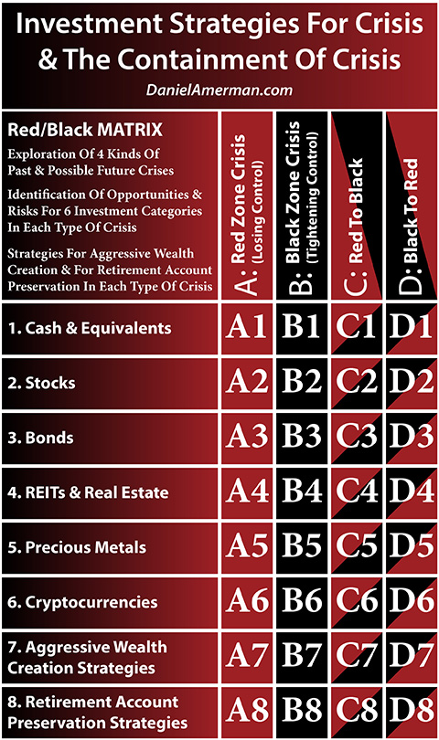
(More information on the matrix and how to use it is linked here).
What we have explored in this analysis falls into the D2 matrix cell. It takes a look at one aspect of what could happen to the 2nd investment category row, that of stocks, in the "D" column, which is the movement from the Black Zone of the containment of crisis into the Red Zone of a new round of crisis.
*******************************